
2025
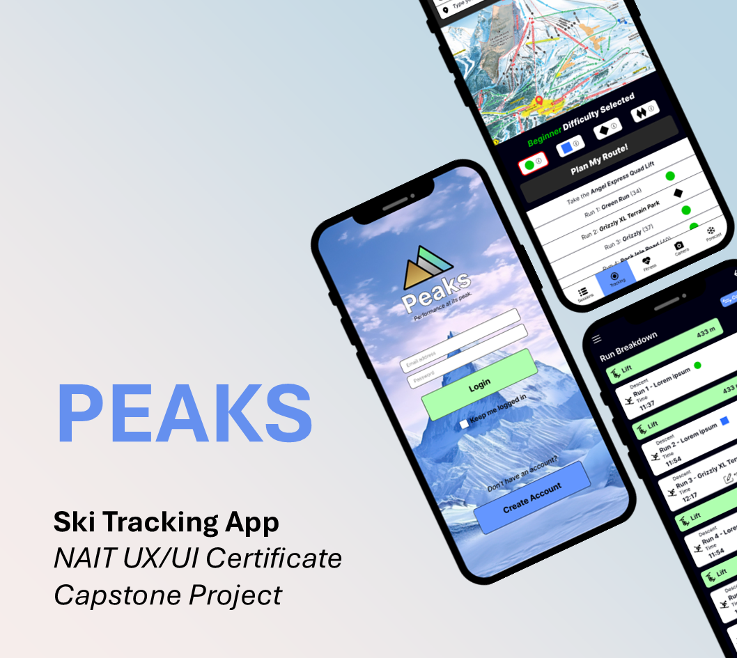
PEAKS
PEAKS is a mobile ski tracking app concept created as my NAIT UX/UI Capstone. As the sole UX/UI designer, I led the project from user research to a tested high-fidelity prototype, designing a simple, user-centered experience for casual and intermediate skiers.
ROLE
Sole UX/UI Designer
TEAM
Solo Project
PROJECT DURATION
4 Weeks
TOOLS
Figma, Figjam
DELIVERABLES
Research • Personas • Journey Maps • Wireframes • Interactive Prototype • Usability Testing • Branding
READ TIME
5 Minutes
INSTRUCTOR FEEDBACK
“Your prototype and supporting documents really stood out this semester. You clearly demonstrated a strong grasp of both UX and UI principles.”
“Your attention to user flows, usability, and problem-solving really came through, especially in how you guided users through complex interactions.”
— Lara Alameddine, NAIT UX/UI Instructor
THE PROBLEM
Casual and intermediate skiers need a simple, reliable way to track runs, compare performance, and navigate the mountain without GPS interruptions, battery drain, or unnecessary complexity. The solution prioritizes intuitive navigation, lightweight performance tracking, and an approachable user experience.
THE PROCESS
The project followed a user-centered design process from research through testing, with each phase informing the next through continuous user feedback.
01. RESEARCH
01. RESEARCH
02. DEFINE
03. IDEATE
04. PROTOTYPE
05. TEST
06. IMPLEMENT
User Interviews
Five casual skiers and snowboarders in their mid-thirties participated in user interviews. Most ski several times each season and regularly use activity-tracking apps.
Sample questions asked during user interviews:
What kind of information would you find most useful when tracking your skiing/snowboarding?
What kind of gear do you usually bring with you? (Smartphone, smartwatch, action camera, etc.)
How important is real-time tracking vs. post-run analysis for you?
Key Insights
Users preferred simple tracking over advanced analytics.
Speed, distance, elevation, and route maps were the most valued metrics.
Lightweight social features were desirable.
GPS reliability and battery life were major concerns.
Existing apps felt overly complex.
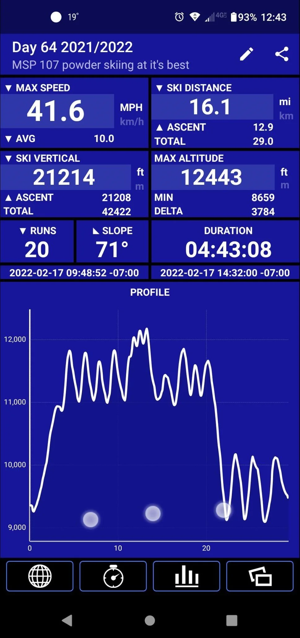
Competitor Research
Ski-specific and general fitness apps were analyzed to evaluate features, usability, battery performance, and user experience. This research highlighted opportunities to simplify navigation while improving reliability and usability.
Ski Tracker ®
Visual Design
User Journey Maps
Journey maps visualized each user's goals, actions, emotions, and pain points from starting a session to reviewing performance. This helped identify opportunities to reduce friction and prioritize features.
Scope
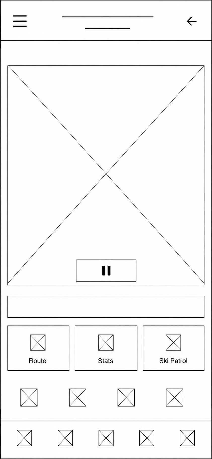
The scope focused on session tracking, route planning, run analysis, and performance comparison. Advanced analytics and extensive social features were intentionally excluded.
03. IDEATE
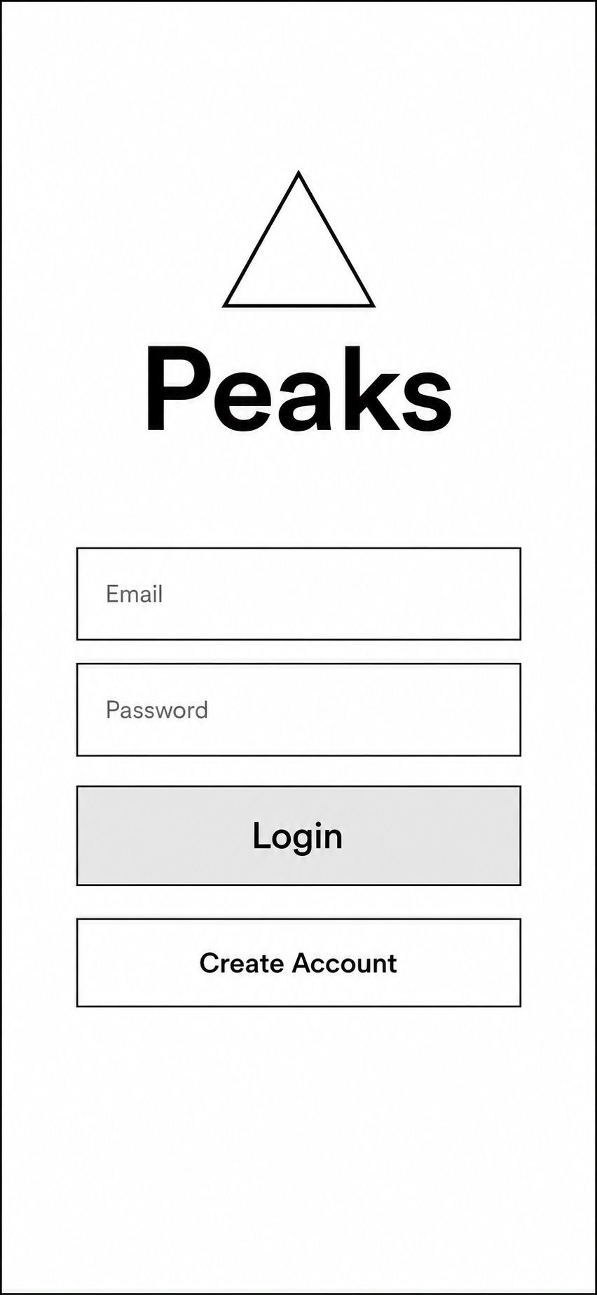
Wireframes
Low- and mid-fidelity wireframes were used to rapidly explore layouts, navigation, and information hierarchy before visual design.

High Fidelity Mockups
#ADFFAD

#6697FF

#908F94
#292929
User Testing
Participants completed realistic skiing tasks using a high-fidelity prototype while thinking aloud. Their feedback identified issues with navigation, readability, route planning, and information hierarchy.
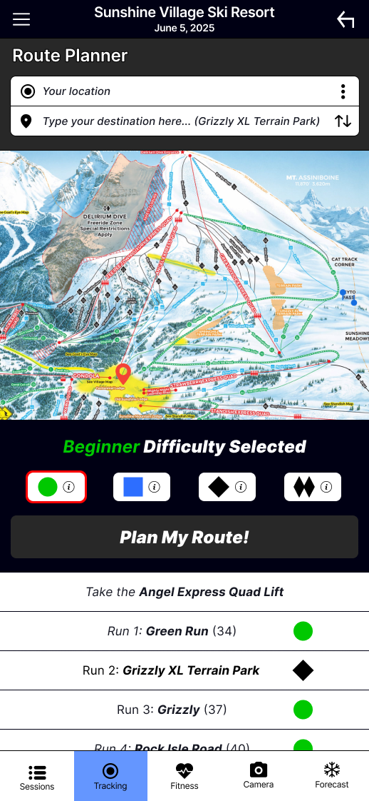
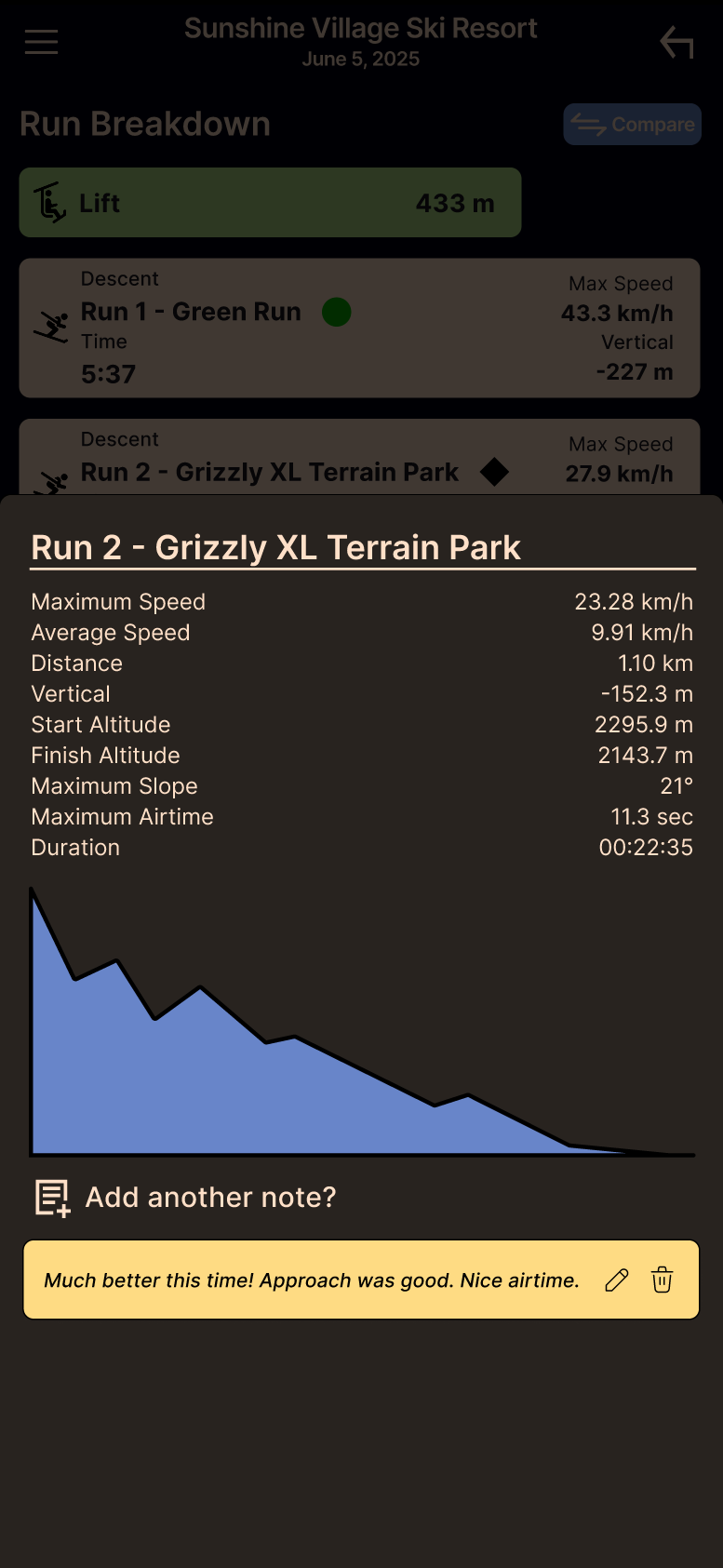
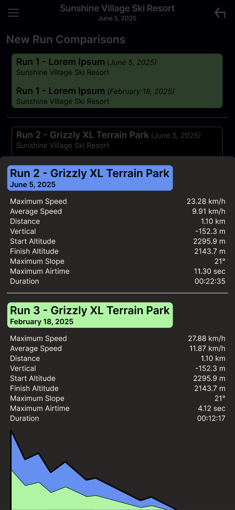
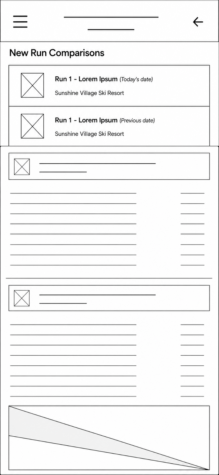
Scenario: You are a returning user who previously recorded a ski trip to Sunshine Village. During your last visit in February, you fell in the a terrain park, but you can't remember which run it was. You've returned to Sunshine on June 5, 2025, and want to improve your performance on that same run.
Log in and open your February Sunshine Village session.
Identify the run where you previously fell.
Start a new session for Sunshine Village (June 5, 2025).
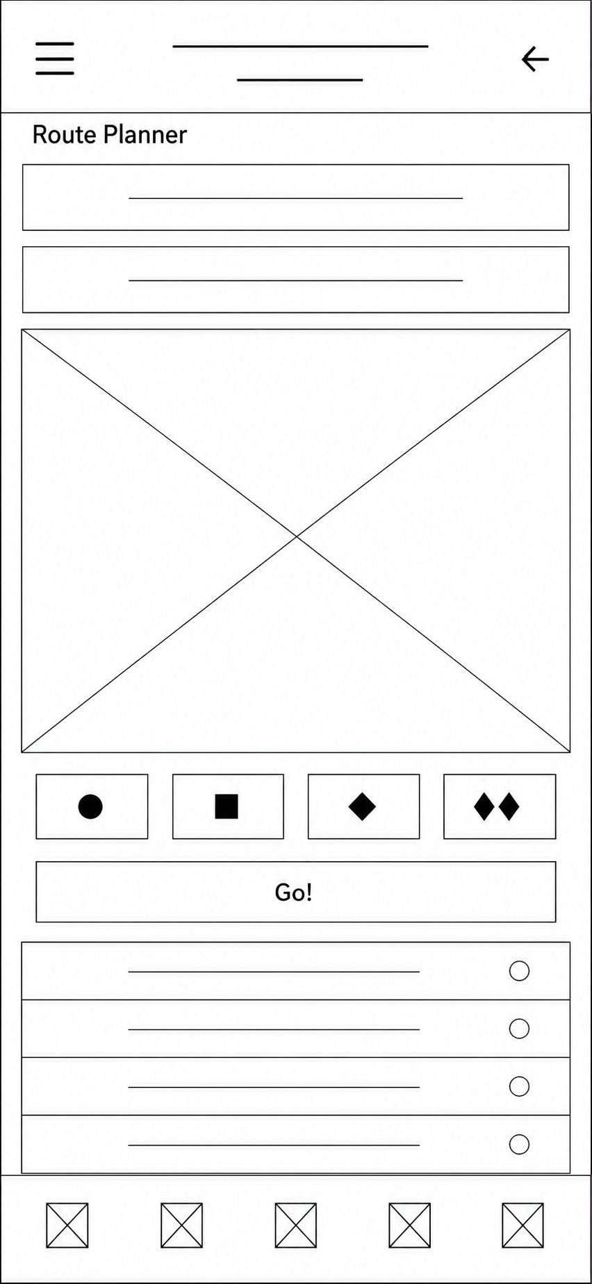
Create the easiest route from the base of the Angel Express Lift to the Grizzly XL Terrain Park.
After completing the run, compare your new performance with the February run.
Determine how many more seconds of airtime you achieved on your latest run.
Hand Off
Final deliverables included high-fidelity mockups, an interactive Figma prototype, reusable components, user flows, and implementation notes.
If launched, success would be measured through a combination of user engagement, feature adoption, and user satisfaction. The following metrics would help determine whether the app is solving the original problem:
Daily and monthly active users
Session completion rate
Route Planner usage
Run Comparison usage
Average sessions recorded per user
User retention after 30 and 90 days
User satisfaction (CSAT or app store reviews)
Monitoring these metrics would help identify which features provide the greatest value while guiding future product decisions.
1. Future iterations would expand performance tracking with season-over-season comparisons, smartwatch integration, offline GPS support, and continued navigation improvements.
2. Introduce personal goals, achievements, and progress tracking.
3. Conduct another round of usability testing with a larger and more diverse group of users.
Key Outcomes
Interviewed 5 target users.
Completed an end-to-end UX process.
Designed 30+ mobile screens.
Conducted usability testing and iterative redesign.
Built a cohesive design system and interactive prototype.


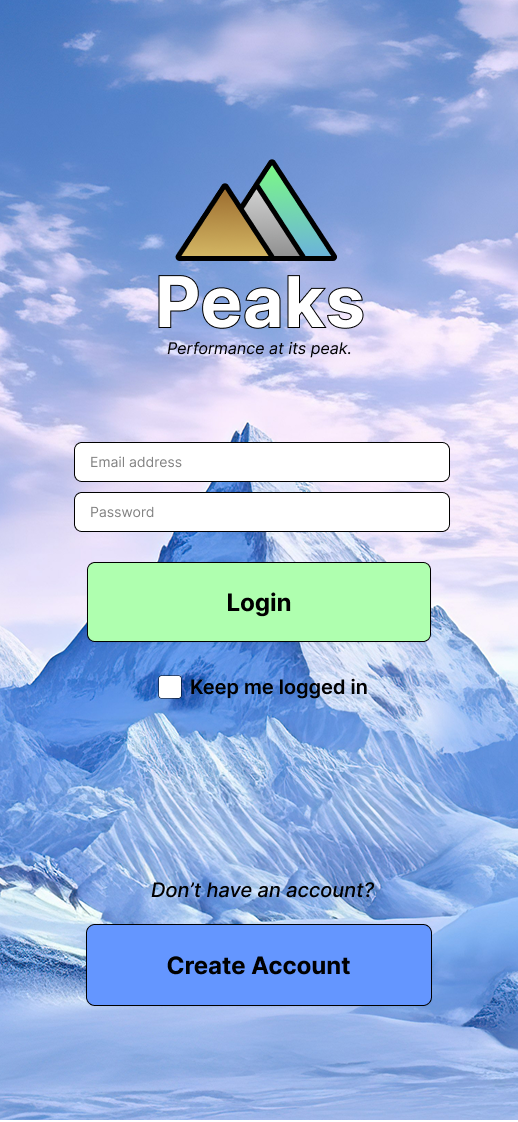
Branding — Large, high-contrast buttons with generous spacing improve usability, even while wearing ski gloves. The three-triangle logo represents mountain peaks, while the tagline reinforces the app's focus on performance and progression.
Iconography — Familiar sports and fitness icons reduce the learning curve, allowing users to quickly recognize features and navigate with confidence.
Logo Drafts


User Personas
Multiple user personas were created to represent key user groups, each with distinct backgrounds, skiing habits, goals, and motivations. These personas helped guide design decisions throughout the project.
“I want to push my limits and see my progress in real time." — "Skiing is more fun when you do it with friends!" — “I just want to have fun and enjoy the scenery!"
Ski Tracks ®

Color Palette — Soft, earthy tones reflect the mountain environment, while a dark interface improves contrast and readability in bright outdoor conditions.
DESIGN FOR USERS, NOT EXPERTS
PEAKS was my first opportunity to take a product from initial research through wireframing, prototyping, usability testing, and iteration. One of my biggest takeaways was learning how easy it is to design from the perspective of an expert rather than the perspective of a user.
As an experienced skier, trail maps, lift layouts, and difficulty symbols like the green circle, blue square, and black diamond felt second nature. During usability testing, however, I watched participants hesitate over features that seemed obvious to me. It was a humbling reminder that users bring different experiences and levels of knowledge to a product. That experience changed how I approach design. Instead of asking, “Does this make sense to me?” I now ask, “Will this make sense to someone using it for the first time?”
LESS CAN BE MORE
My initial instinct was to include more features and performance data, but research consistently showed that casual skiers valued simplicity over complexity. Learning what not to build became just as important as deciding what to include.
ITERATION CREATES BETTER PRODUCTS
Every round of research and usability testing uncovered opportunities to improve the experience. Clearer labels, simplified navigation, and better information hierarchy made the final prototype far more intuitive than the original concept. PEAKS reinforced that great UX isn't about getting the design right the first time—it's about listening, testing, and continuously improving based on real user feedback.
GROWING AS A DESIGNER
More than anything, this project gave me confidence in my ability to tackle complex design problems with curiosity, empathy, and an iterative mindset. It reinforced that the best solutions come from understanding users, challenging assumptions, and embracing feedback throughout the design process.
There’s more to explore


#FFF9A8
MEASURING SUCCESS
NEXT STEPS
LESSONS LEARNED
Slopes ®
Check out other works by Ivan
02. DEFINE
04. PROTOYPE
05. TEST
Testing Insights
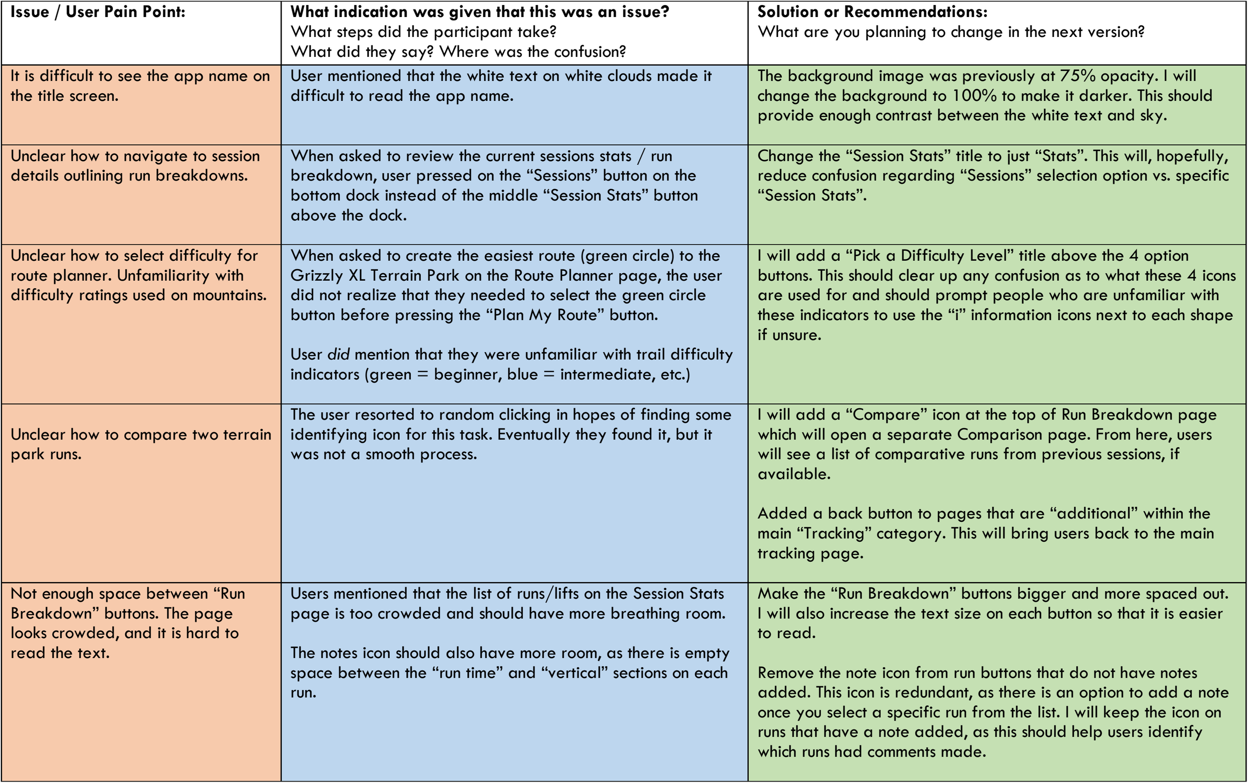
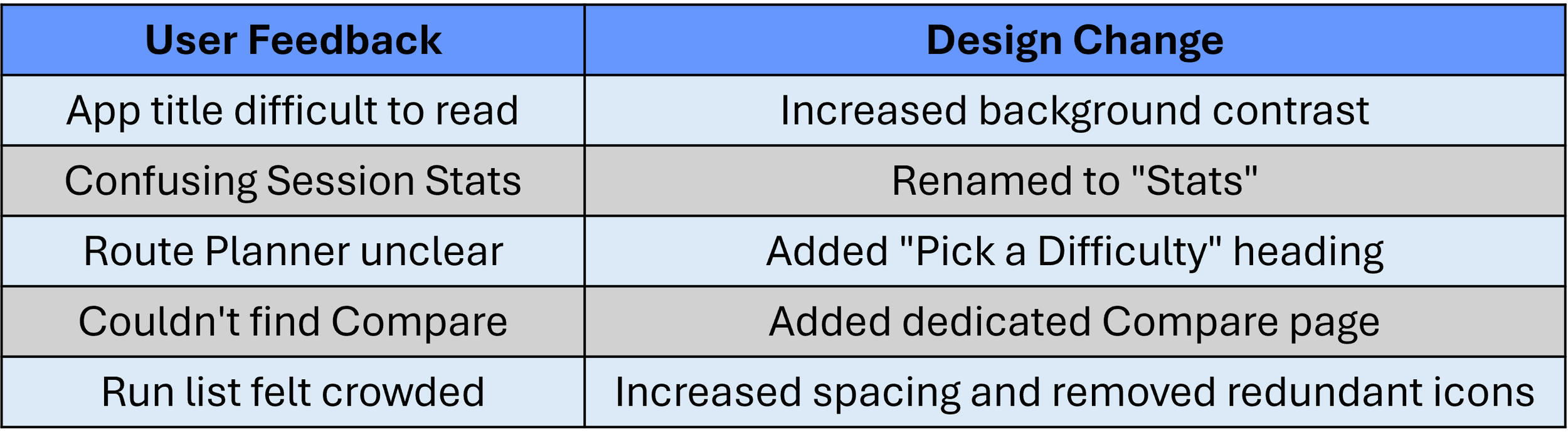
Usability testing uncovered several recurring pain points that informed the final design:
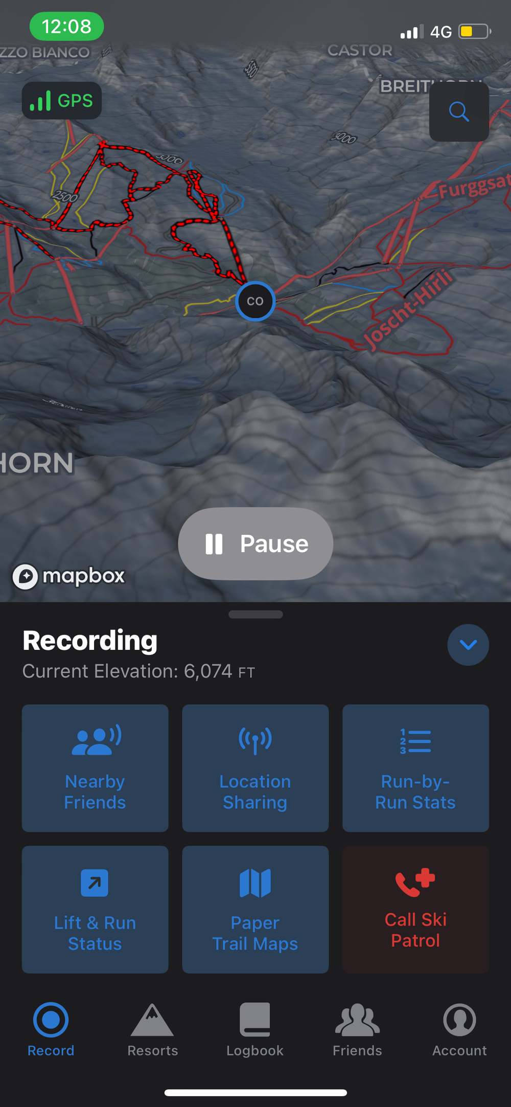
Screen Readability: Participants found the app name difficult to read against the bright background image, prompting an increase in background contrast.
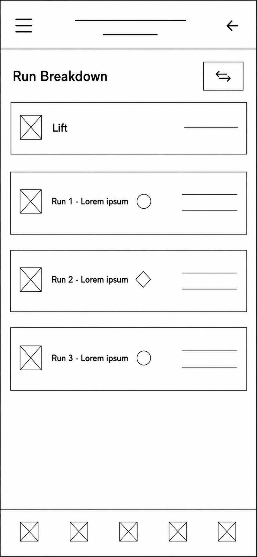
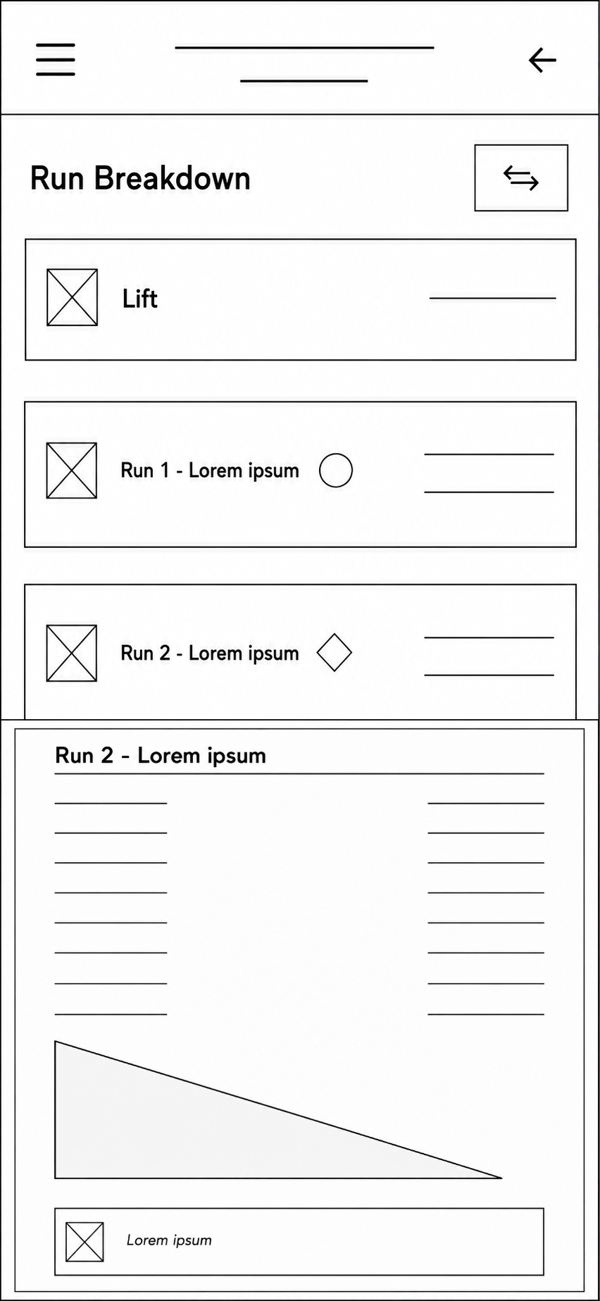
Navigation: Some users expected run details to be located under Sessions rather than Session Stats, leading to simplified labels and clearer navigation.
Route Planning: Participants were unsure they needed to select a trail difficulty before generating a route, particularly those unfamiliar with ski trail rating symbols. A clearer heading and supporting information were added to guide users.
Run Comparison: Users struggled to locate the run comparison feature, resulting in the addition of a dedicated Compare button and comparison screen.
Hierarchy: Participants felt the run list was crowded and difficult to scan. Increased spacing, larger text, and the removal of unnecessary note icons improved readability and visual hierarchy.
Design Iterations: Each testing round informed the next design iteration, ensuring changes addressed real user needs rather than assumptions.
06. IMPLEMENT