
2025
PEAKS
PEAKS is a mobile ski tracking app concept created as my NAIT UX/UI Capstone. As the sole UX/UI designer, I led the project from user research to a tested high-fidelity prototype, designing a simple, user-centered experience for casual and intermediate skiers.
ROLE
Sole UX/UI Designer
TEAM
Solo Project
PROJECT DURATION
4 Weeks
TOOLS
Figma
DELIVERABLES
Research • Personas • Journey Maps • Wireframes • Interactive Prototype • Usability Testing • Branding
READ TIME
5 Minutes
INSTRUCTOR FEEDBACK
“Your prototype and supporting documents really stood out this semester. You clearly demonstrated a strong grasp of both UX and UI principles.” — Lara Alameddine, NAIT Instructor
“Your attention to user flows, usability, and problem-solving really came through, especially in how you guided users through complex interactions.” — Lara Alameddine, NAIT Instructor

THE PROBLEM
Casual and intermediate skiers need a simple, reliable way to track runs, compare performance, and navigate the mountain without GPS interruptions, battery drain, or unnecessary complexity. The solution prioritizes intuitive navigation, lightweight performance tracking, and an approachable user experience.
THE PROCESS
The project followed a user-centered design process from research through testing, with each phase informing the next through continuous user feedback.
03. IDEATE
04. PROTOTYPE
05. TEST
06. IMPLEMENT

01. RESEARCH
a. User Interviews
Five casual skiers and snowboarders in their mid-thirties participated in user interviews. Most ski several times each season and regularly use activity-tracking apps.
Key Insights
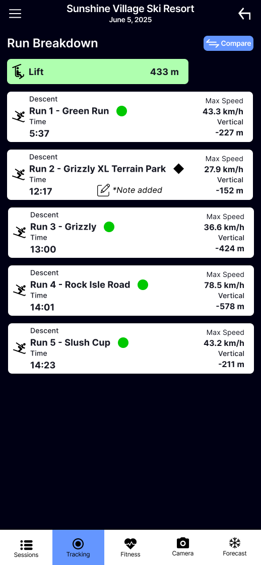
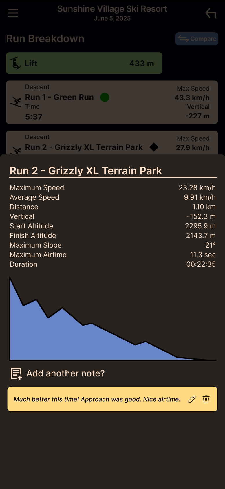
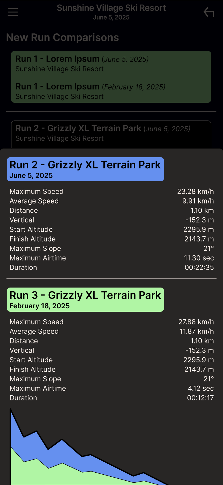
Users preferred simple tracking over advanced analytics.
Speed, distance, elevation, and route maps were the most valued metrics.
Lightweight social features were desirable.
GPS reliability and battery life were major concerns.
Existing apps felt overly complex.
b. Competitor Research
Ski-specific and general fitness apps were analyzed to evaluate features, usability, battery performance, and user experience. This research highlighted opportunities to simplify navigation while improving reliability and usability.
02. DEFINE
User Journey Maps
Journey maps visualized each user's goals, actions, emotions, and pain points from starting a session to reviewing performance. This helped identify opportunities to reduce friction and prioritize features.
Scope
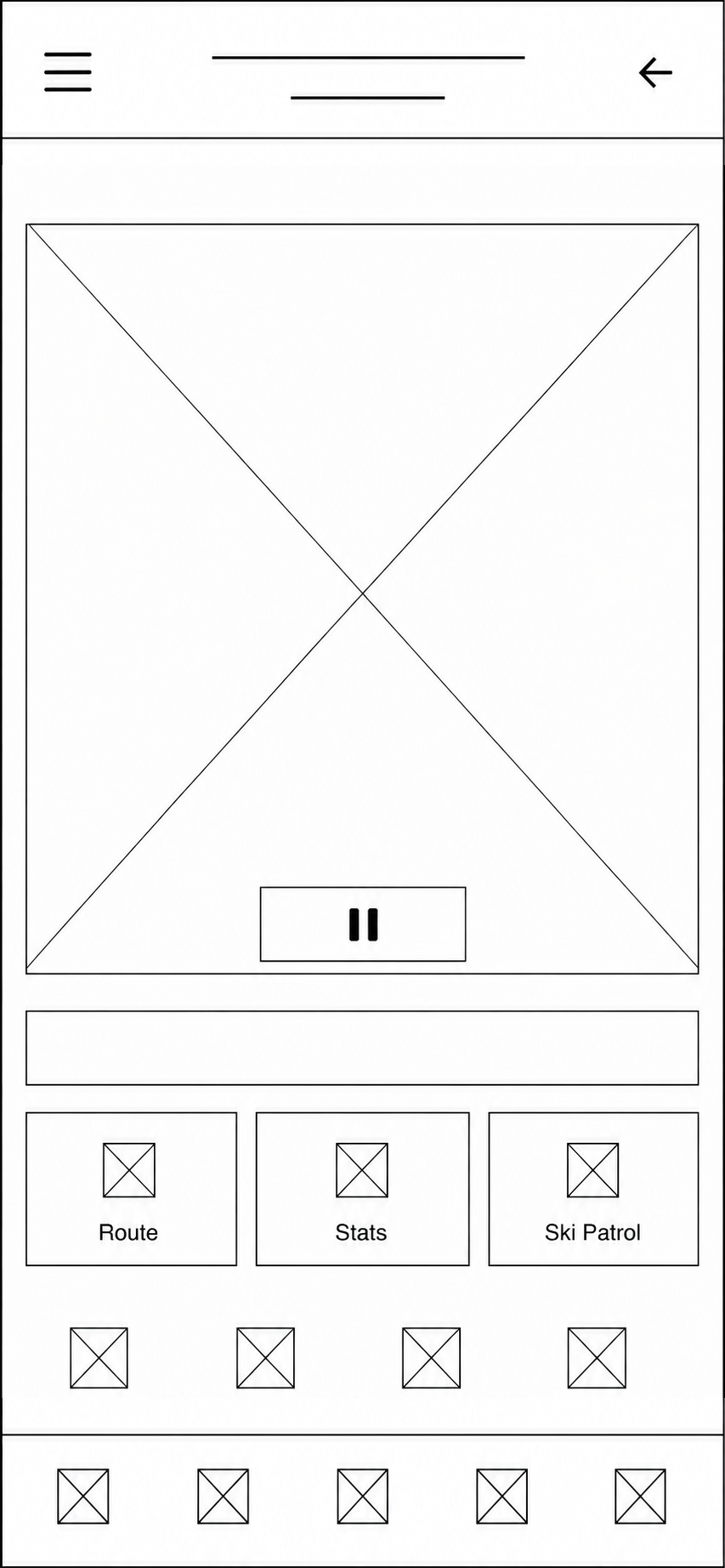
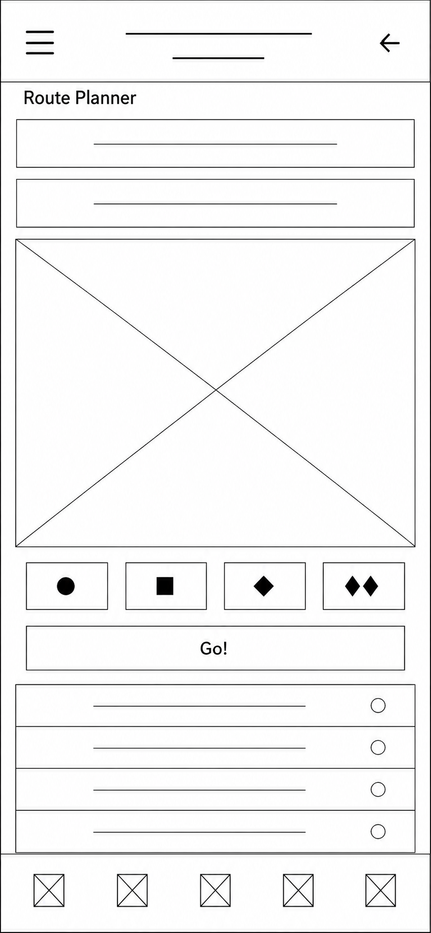
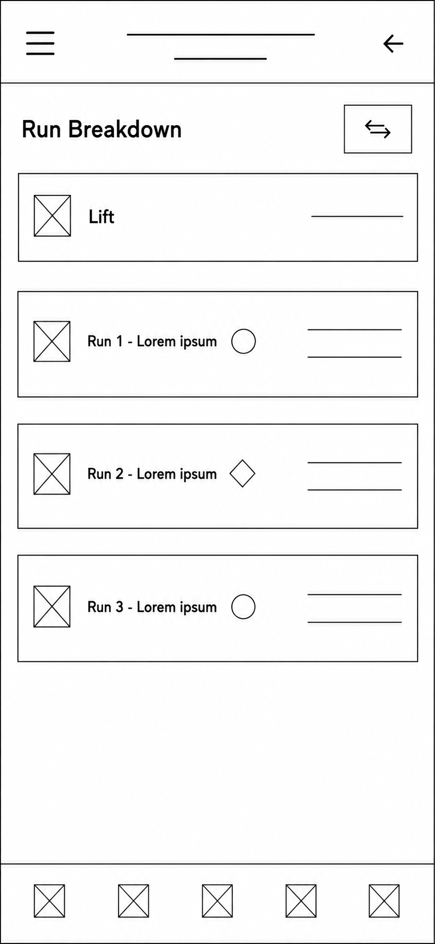
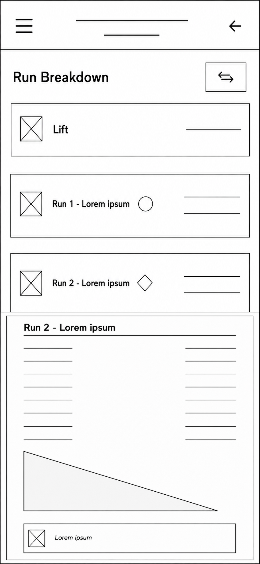
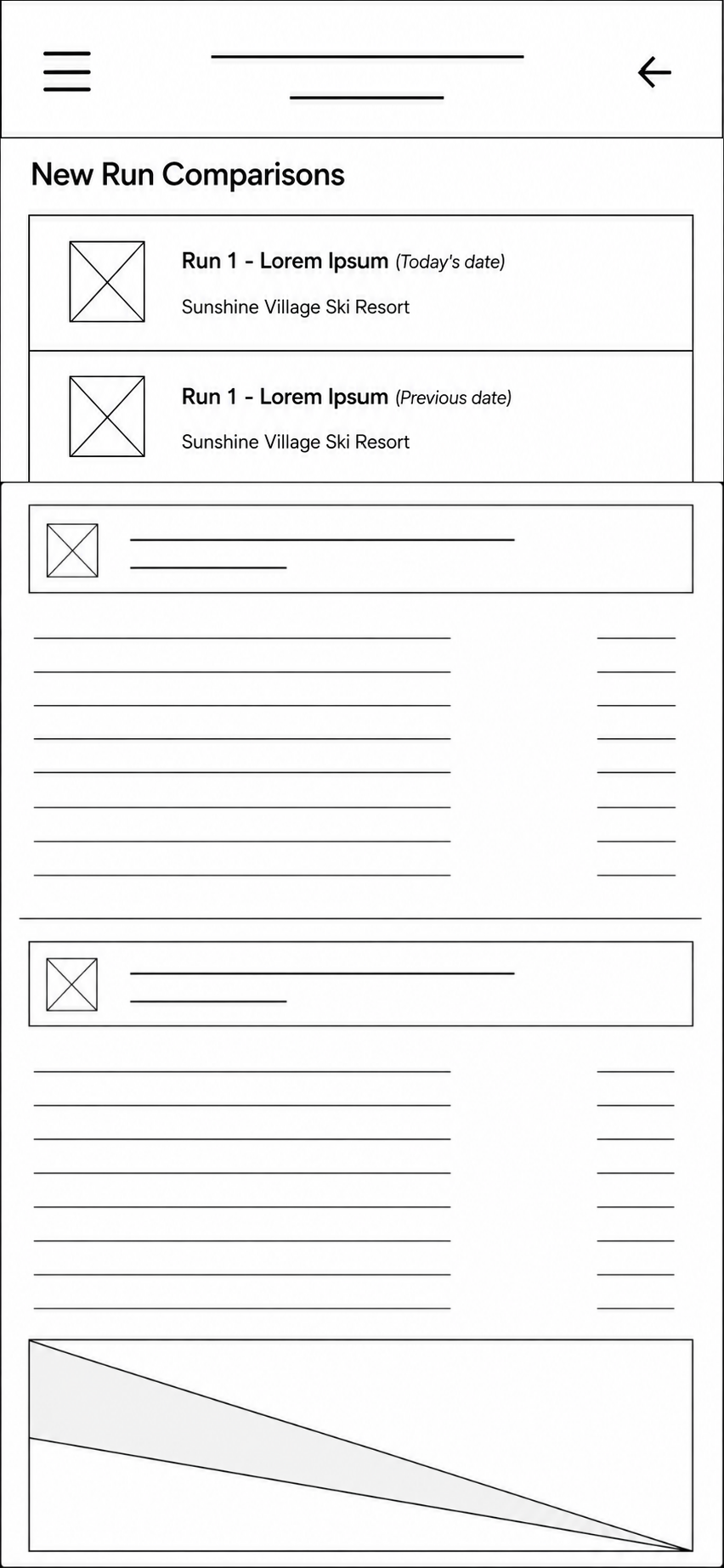
The scope focused on session tracking, route planning, run analysis, and performance comparison. Advanced analytics and extensive social features were intentionally excluded.


03. IDEATE
Wireframes
Low- and mid-fidelity wireframes were used to rapidly explore layouts, navigation, and information hierarchy before visual design.
04. PROTOTYPE
High Fidelity Mockups
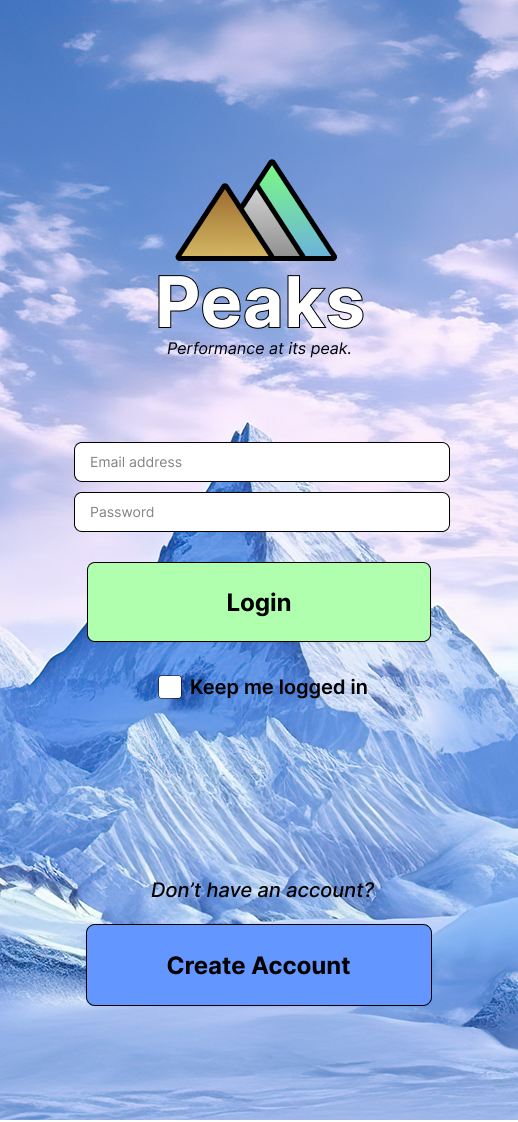
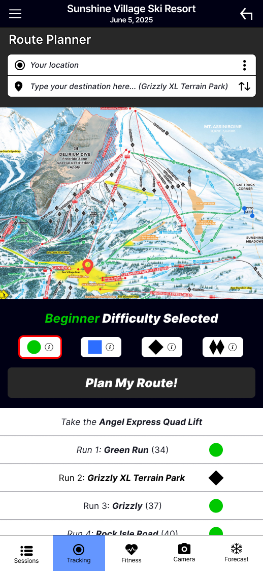
Visual Design
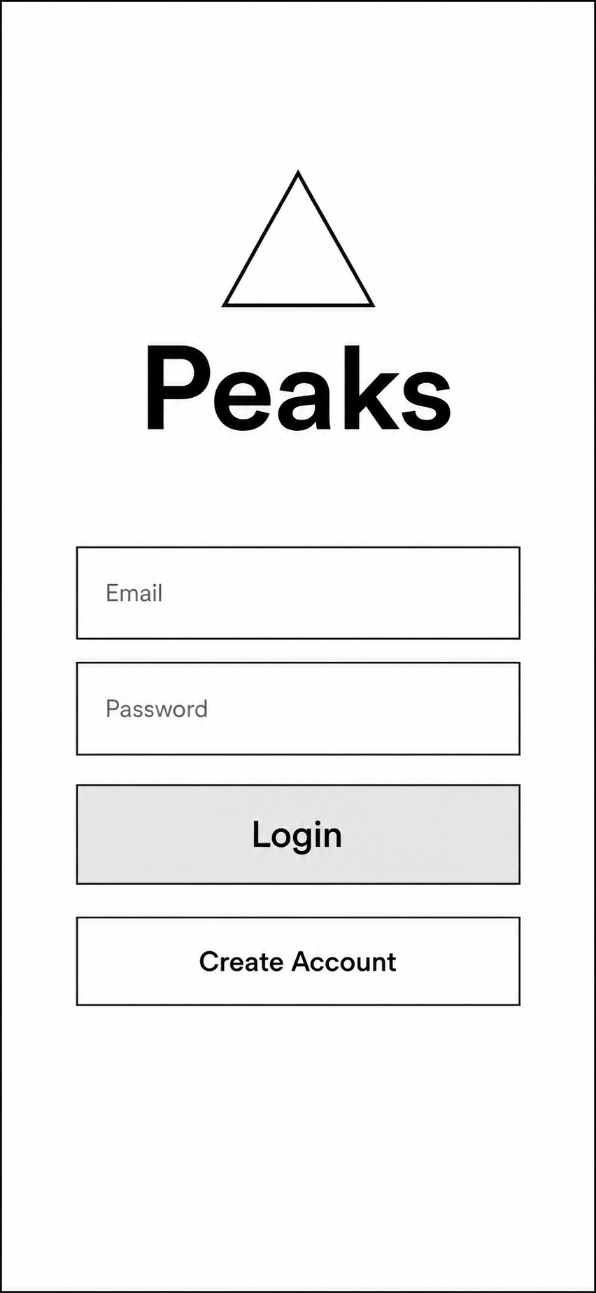
Branding: Large, high-contrast buttons with generous spacing improve usability, even while wearing ski gloves. The three-triangle logo represents mountain peaks, while the tagline reinforces the app's focus on performance and progression.
Color Palette: Soft, earthy tones reflect the mountain environment, while a dark interface improves contrast and readability in bright outdoor conditions.
Iconography: Familiar sports and fitness icons reduce the learning curve, allowing users to quickly recognize features and navigate with confidence.