
2026
UALBERTA INT’L APPLICATION
This is an independent UX case study completed outside of my role at the University of Alberta. It was inspired by recurring questions and challenges observed while supporting prospective international students and does not represent an official redesign or contain confidential institutional data.
PROJECT DURATION
2 Weeks
ROLE
Sole UX/UI Designer
TOOLS
Figma
DELIVERABLES
Research • Wireframes • Interactive Prototype • Usability Testing
READ TIME
3 Minutes
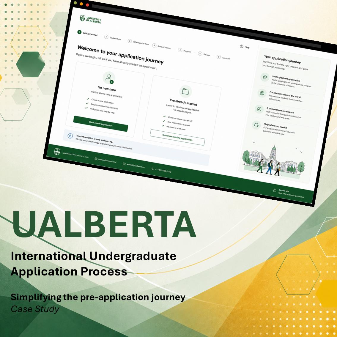
THE PROBLEM
Prospective international undergraduate applicants experience confusion and uncertainty when navigating the University of Alberta's online application process. The solution should deliver a clear, guided experience that simplifies complex workflows, reduces unnecessary friction, and helps applicants complete their applications with confidence.
THE PROCESS
This project followed a user-centered design process from research through implementation, with each phase informing the next through continuous user feedback.

01. RESEARCH
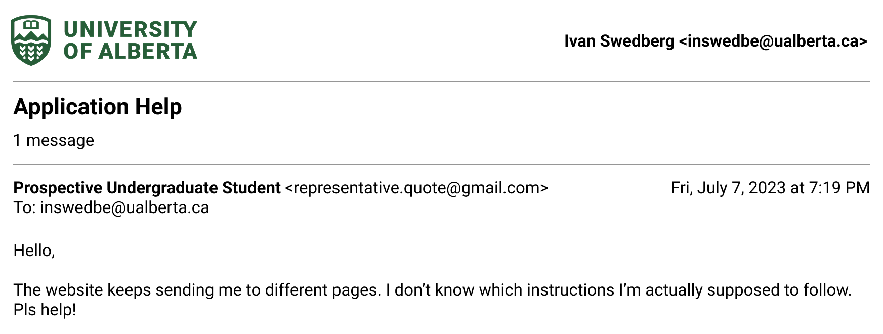
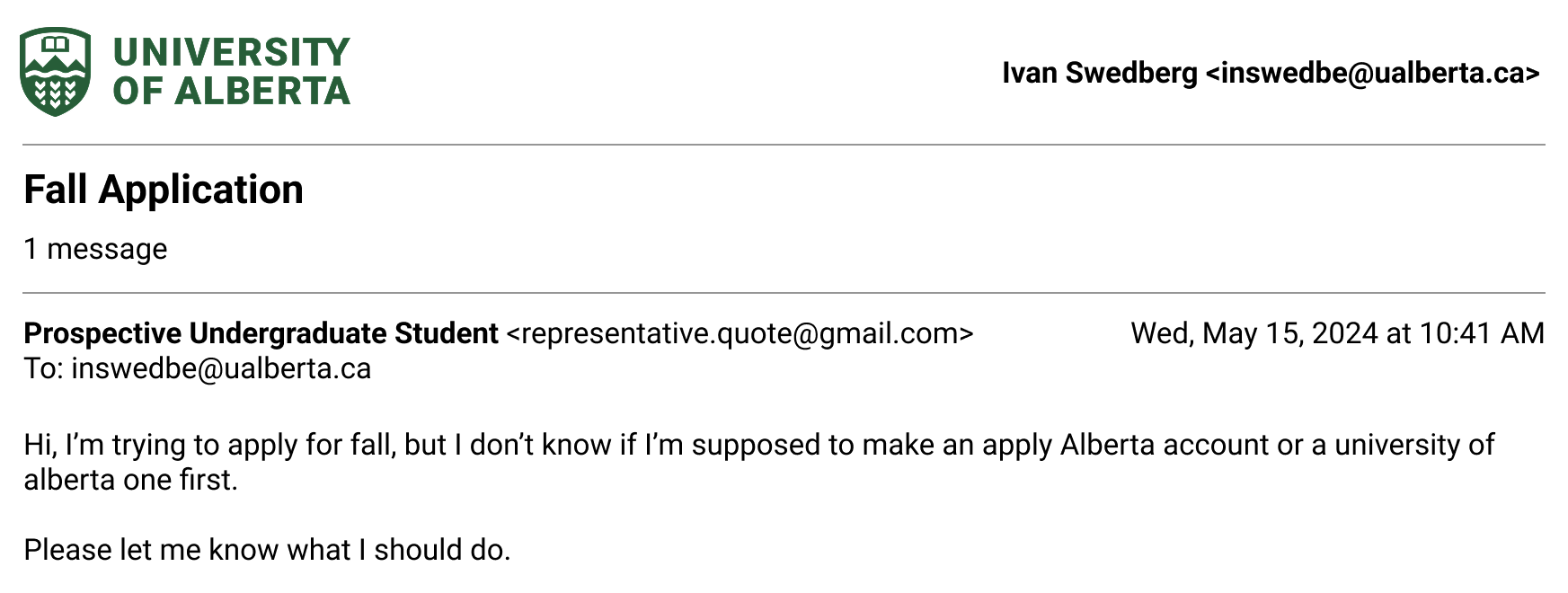
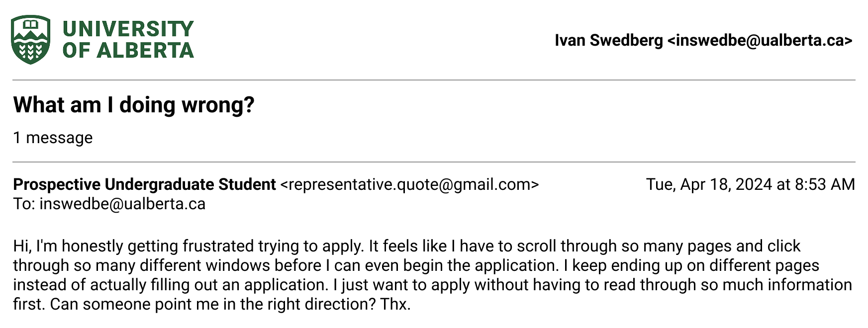
Recurring Student Feedback (Phone, Email, Online- and Video-Chat)
Years of working with prospective international students provided firsthand insight into the most common barriers encountered before students even submitted an application.
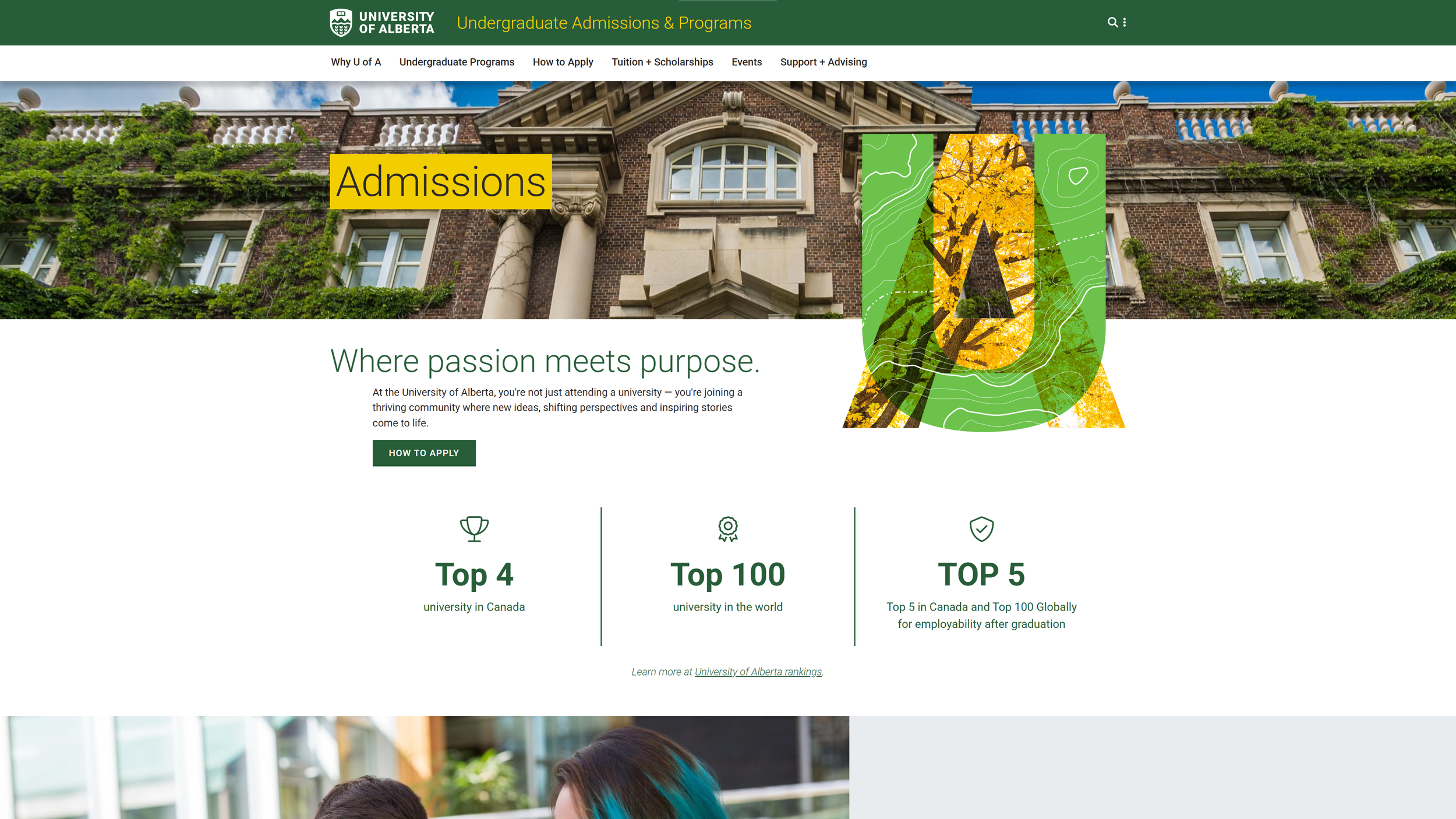
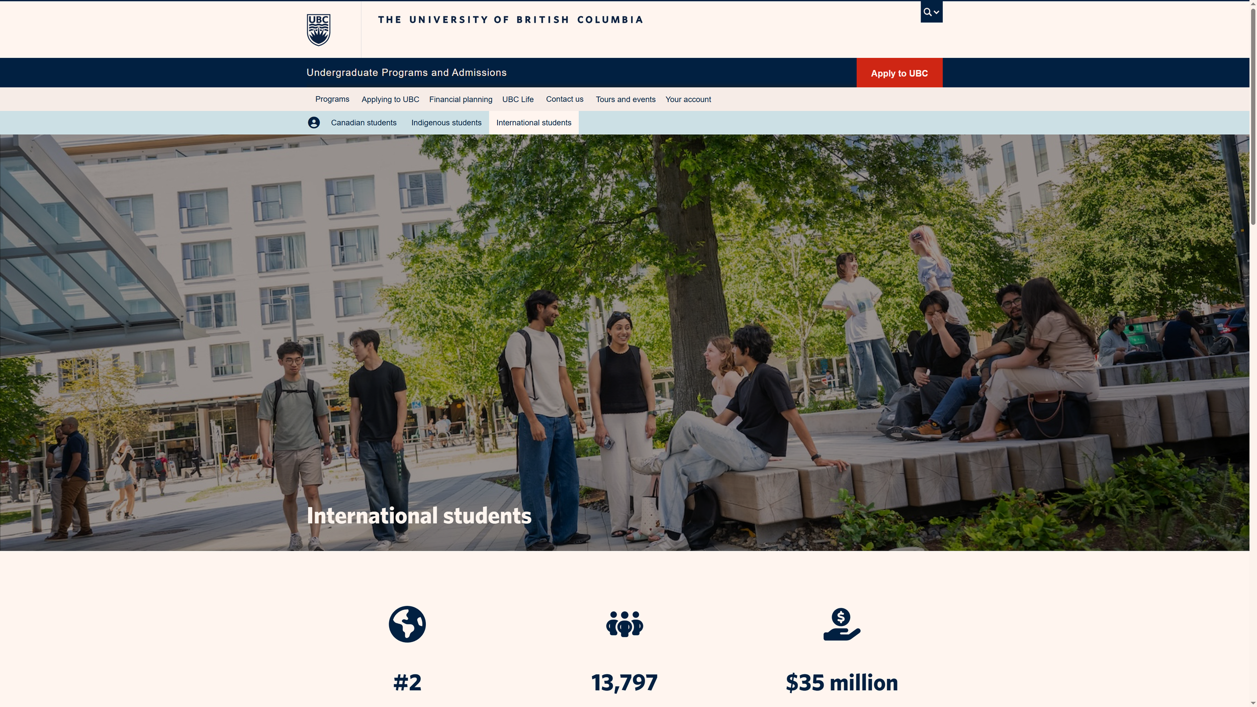
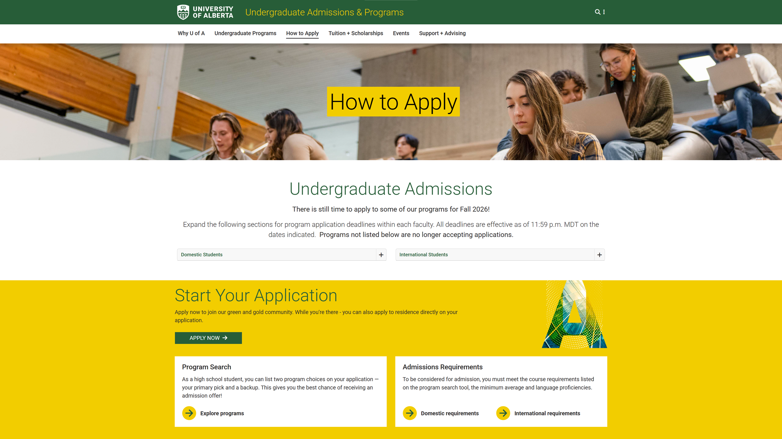
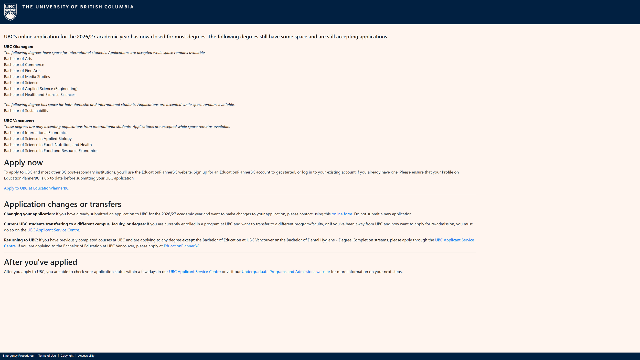
Competitor Research
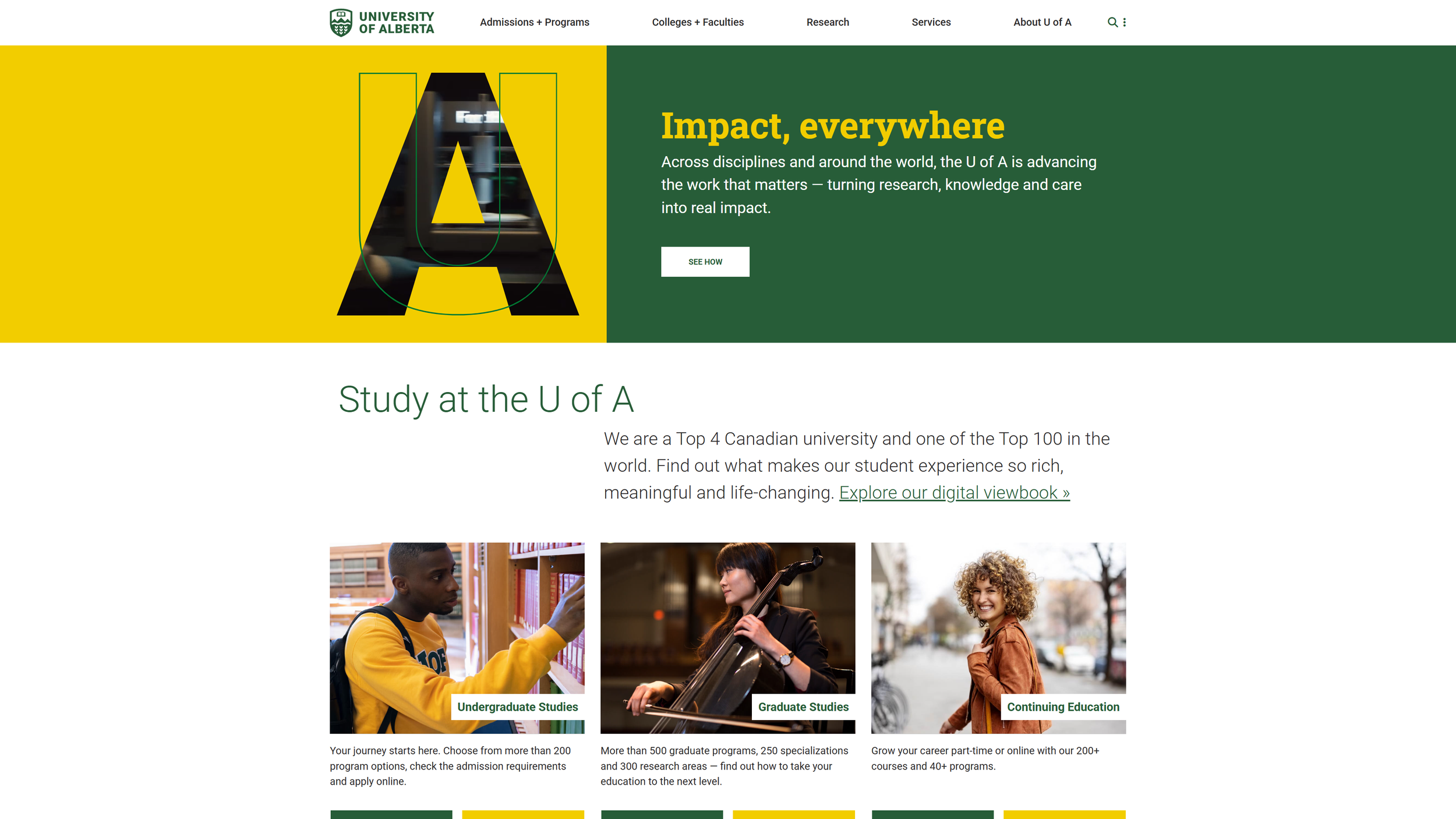
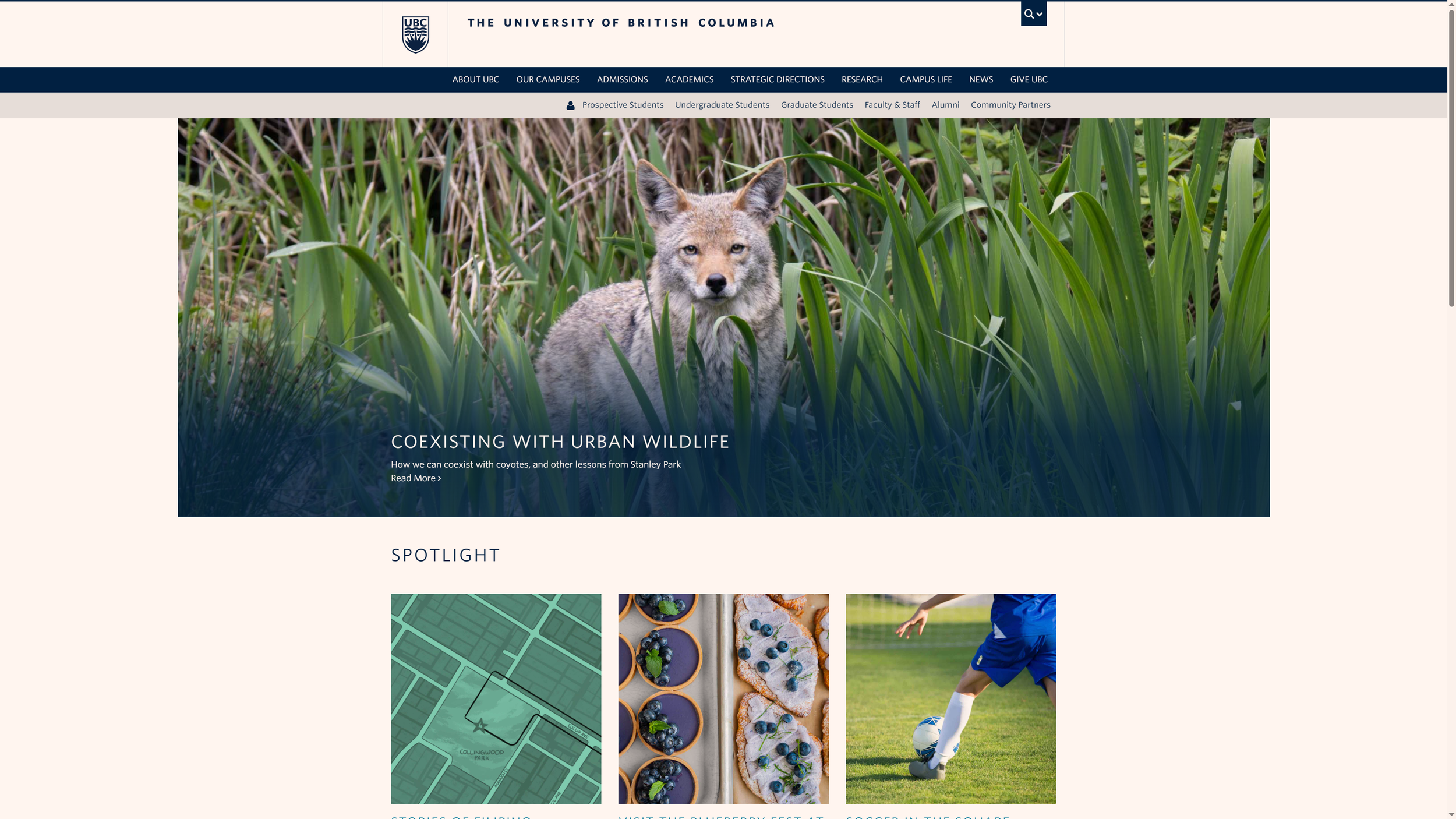
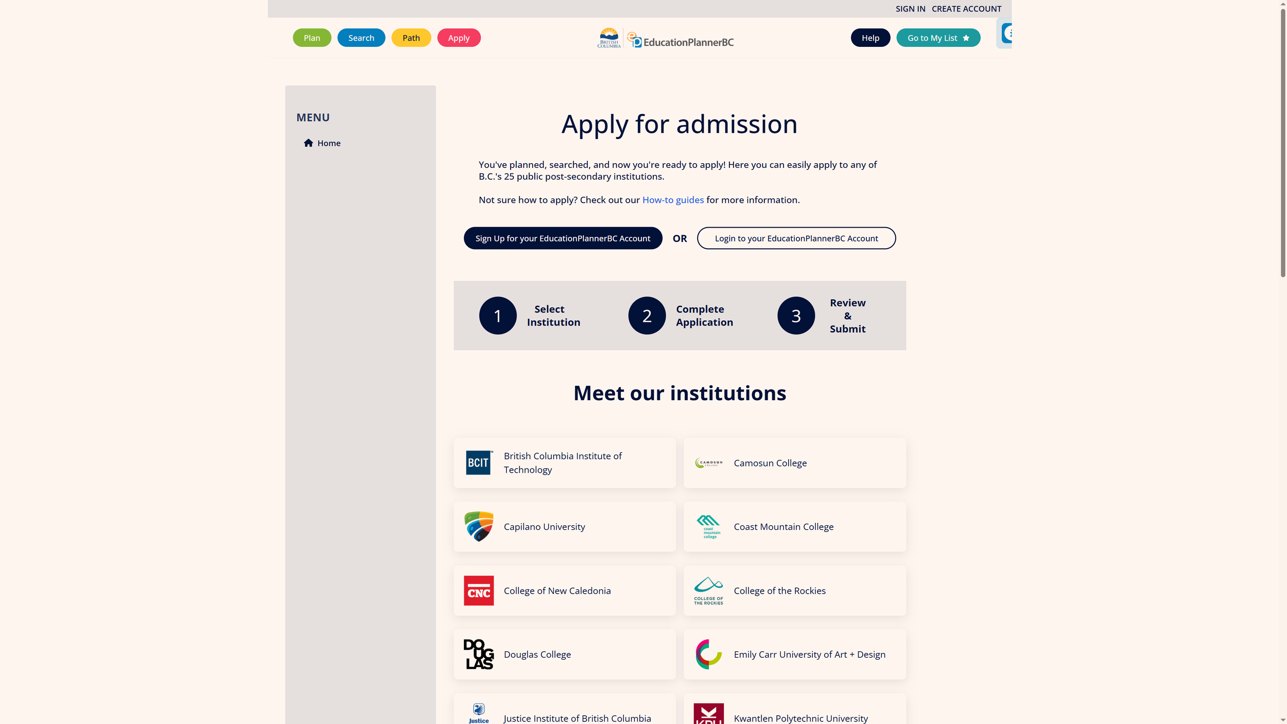
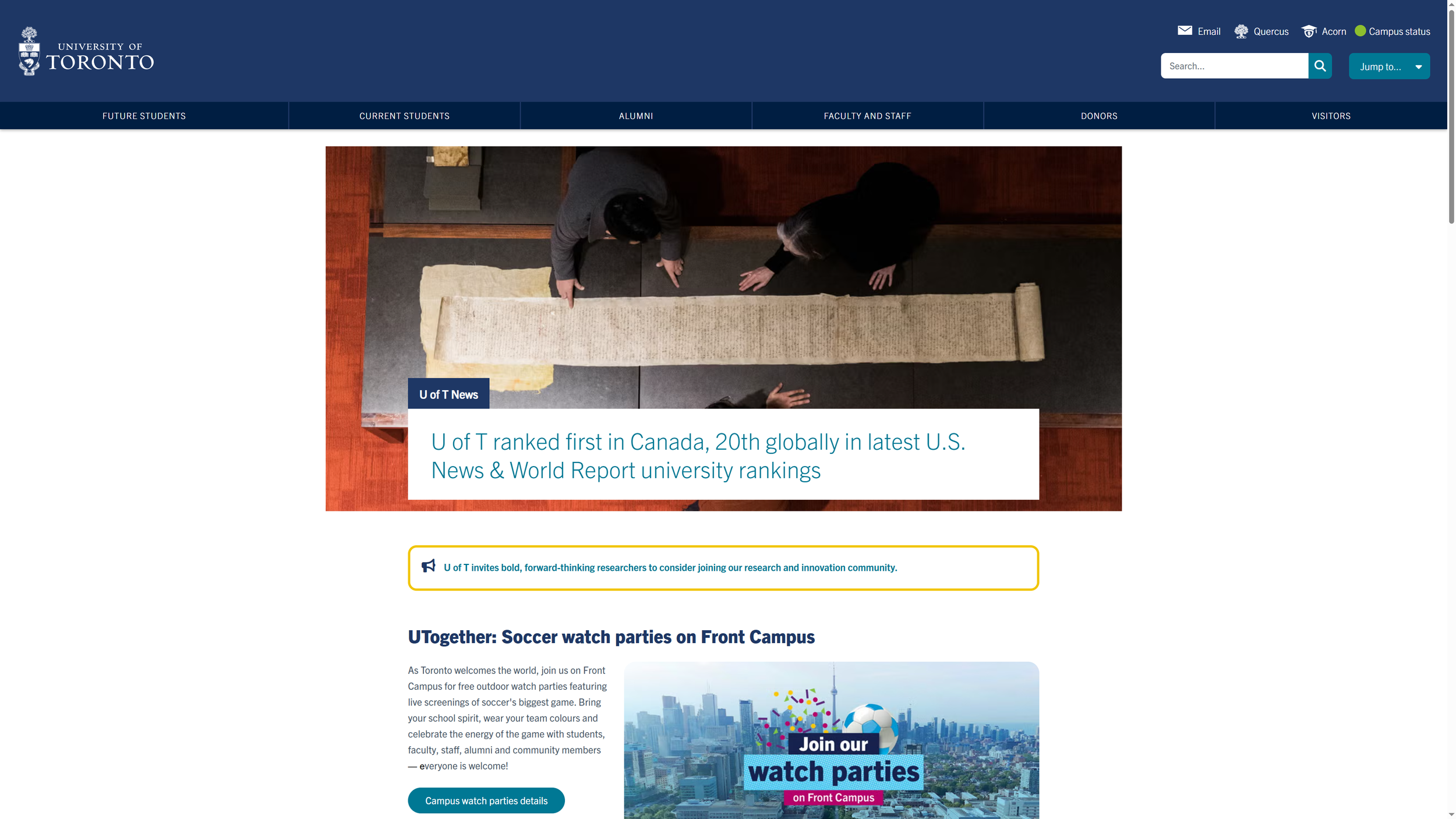
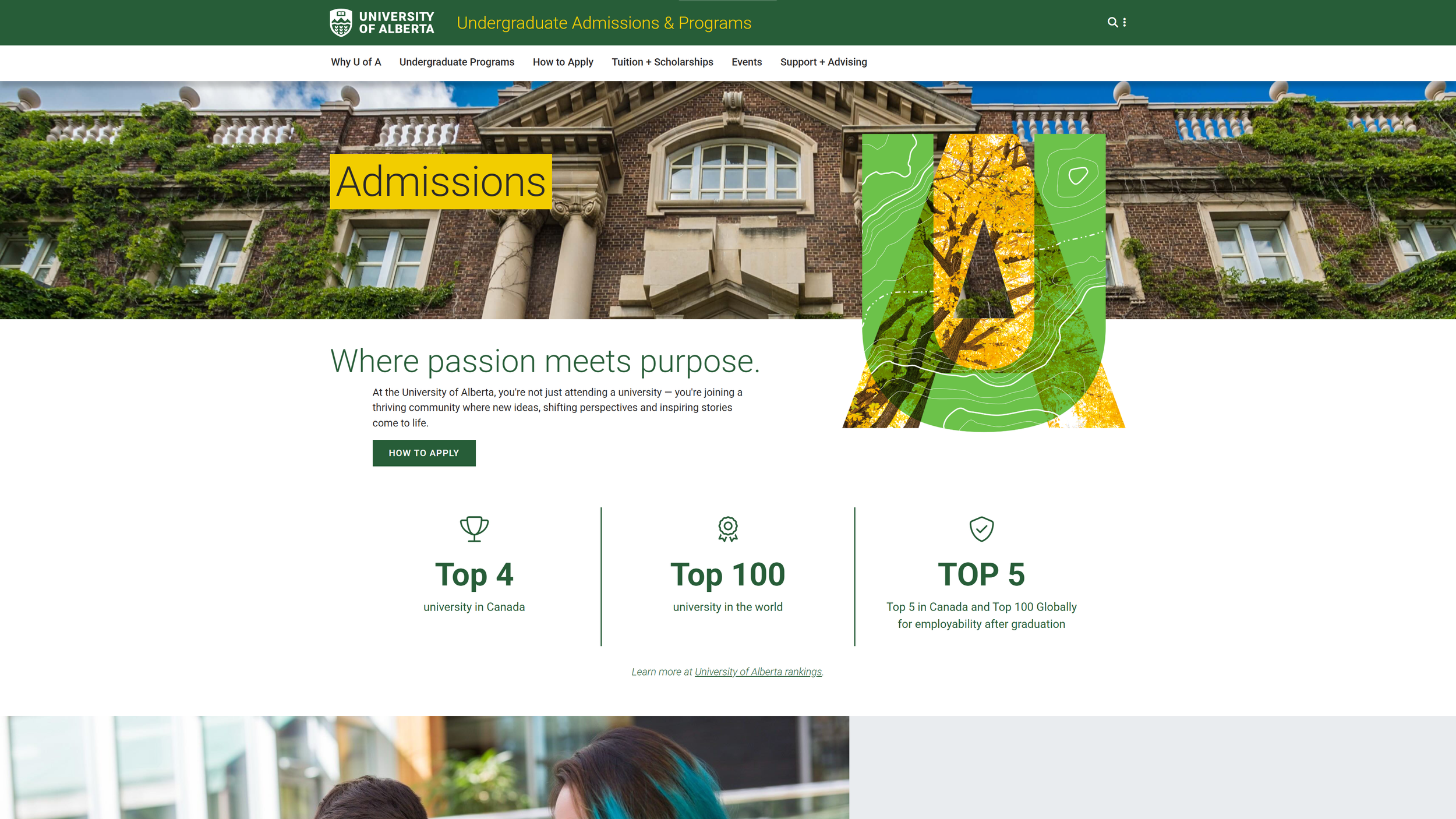
Compared other top 5 Canadian universities’ application processes (number of screens from homepage until application start.
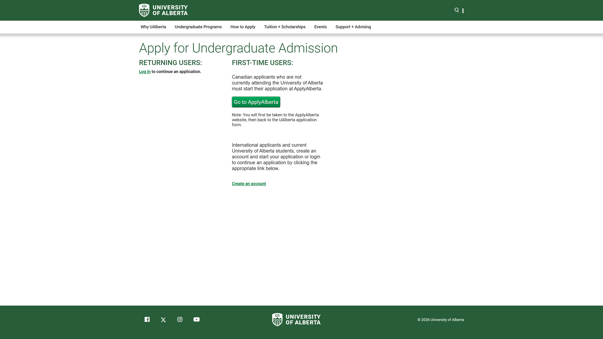
UNIVERSITY OF ALBERTA — 7 PAGES
How Might We...
Make the first step obvious?
Reduce unnecessary reading?
Prepare students before they apply?
Reassure students they haven't missed anything?

Key Insights
Information Overload
Too many pages, links, & text on pages
Navigation Issues
Hard to find application button
Redirected to multiple websites
Looping or broken links
Low Confidence
Unsure about next steps
Unclear Requirements
Hidden checklist
Missing documents
UNIVERSITY OF BRITISH COLUMBIA — 4 PAGES
***The examples above are representative inquiries synthesized from recurring questions and themes observed while supporting prospective students. They are not actual emails and have been recreated to protect privacy while illustrating common usability challenges.
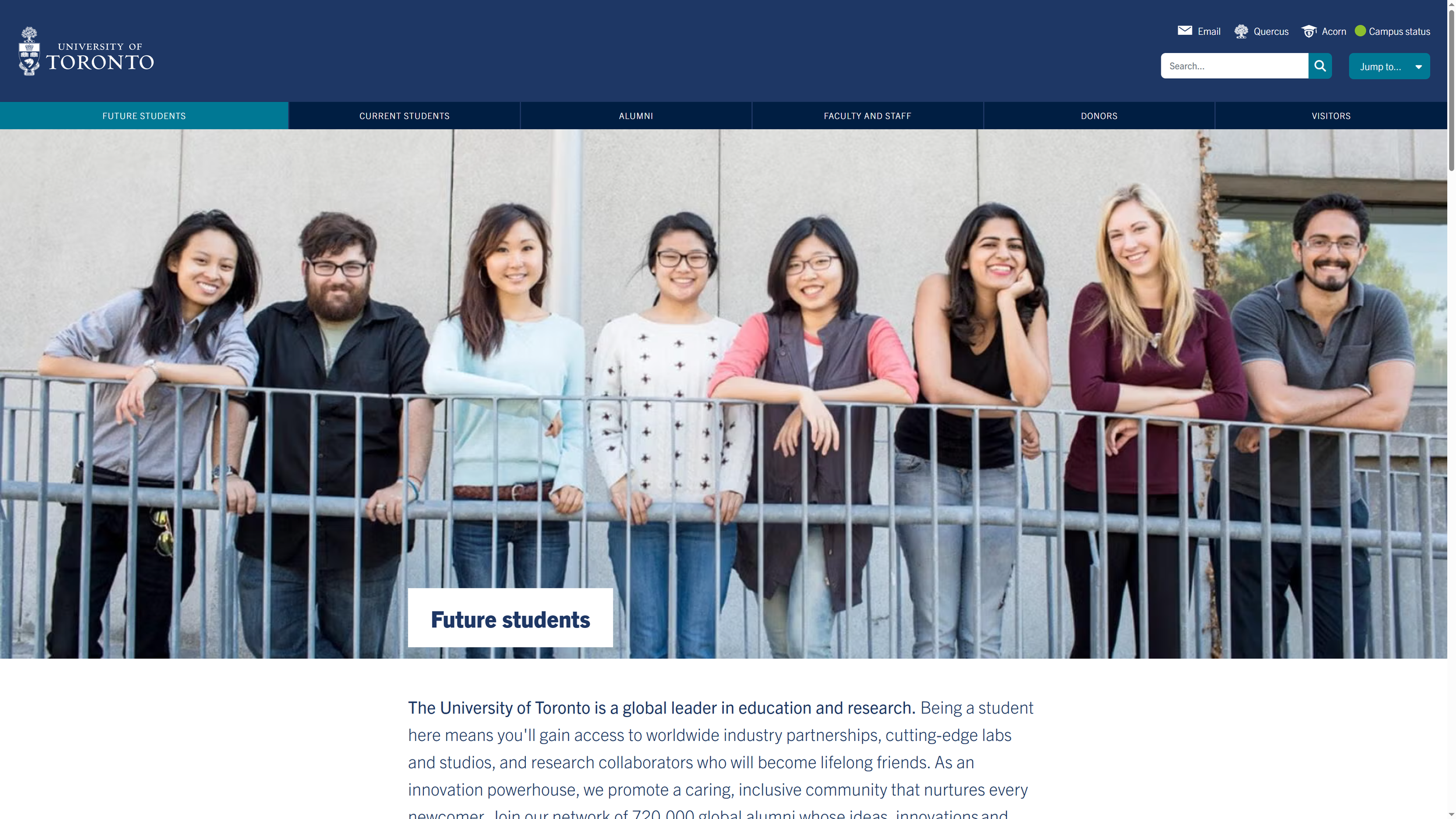
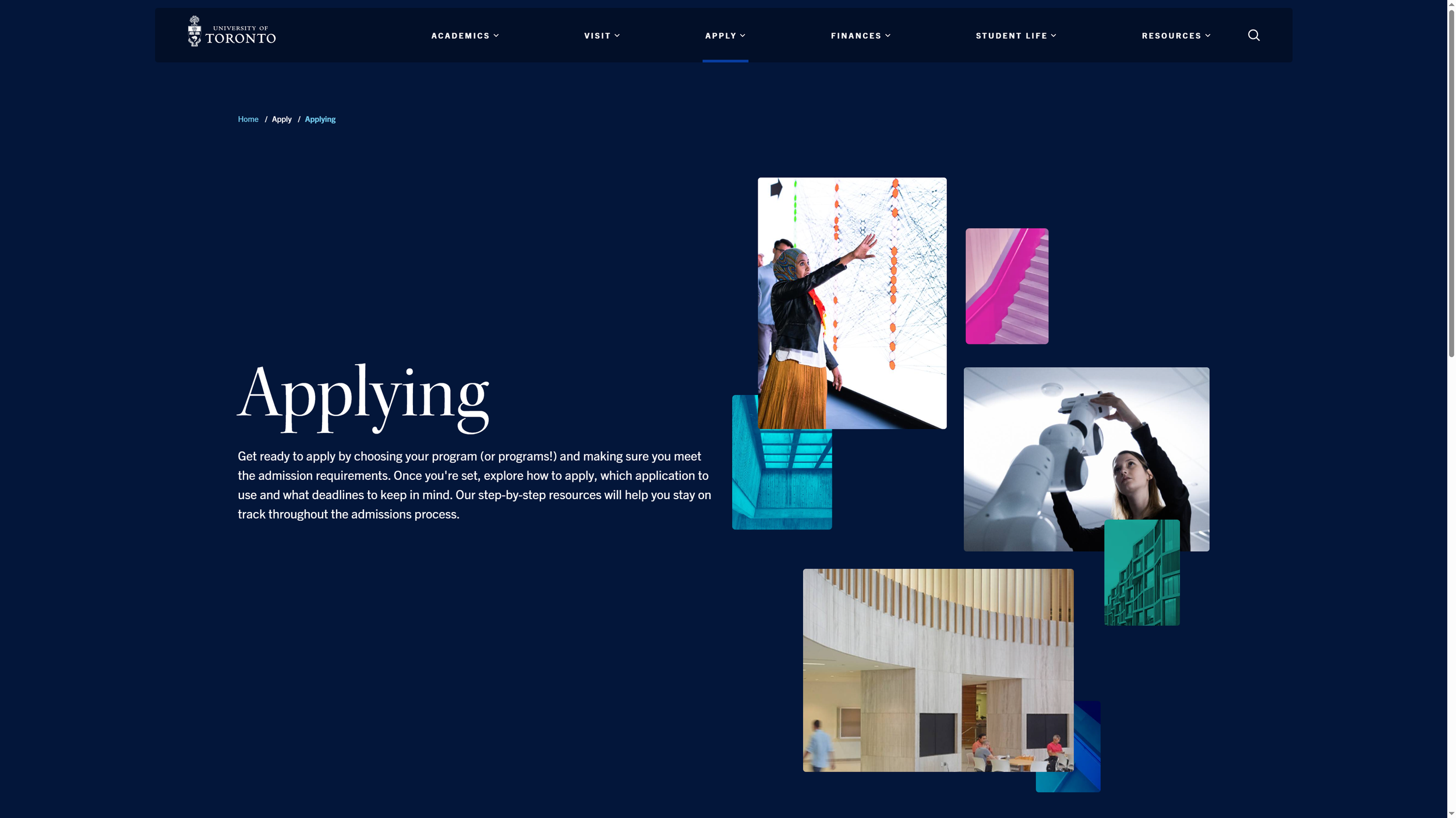
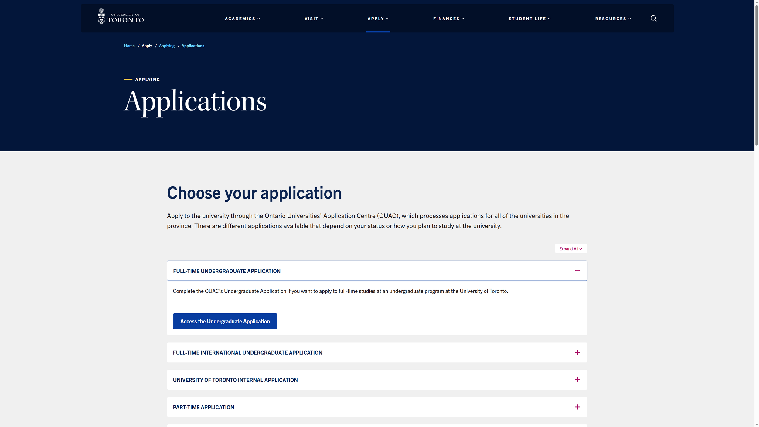
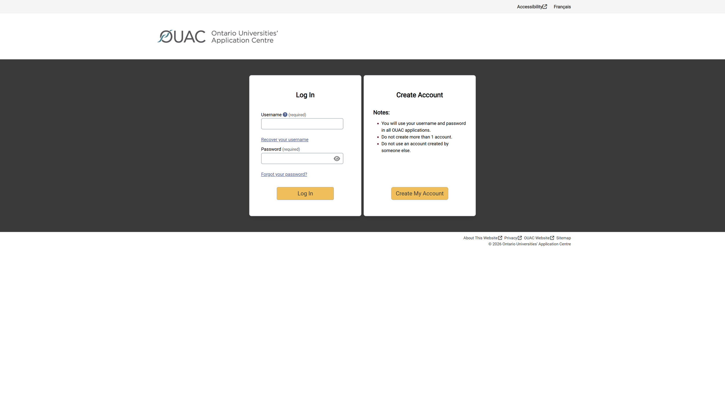
UNIVERSITY OF TORONTO — 5 PAGES
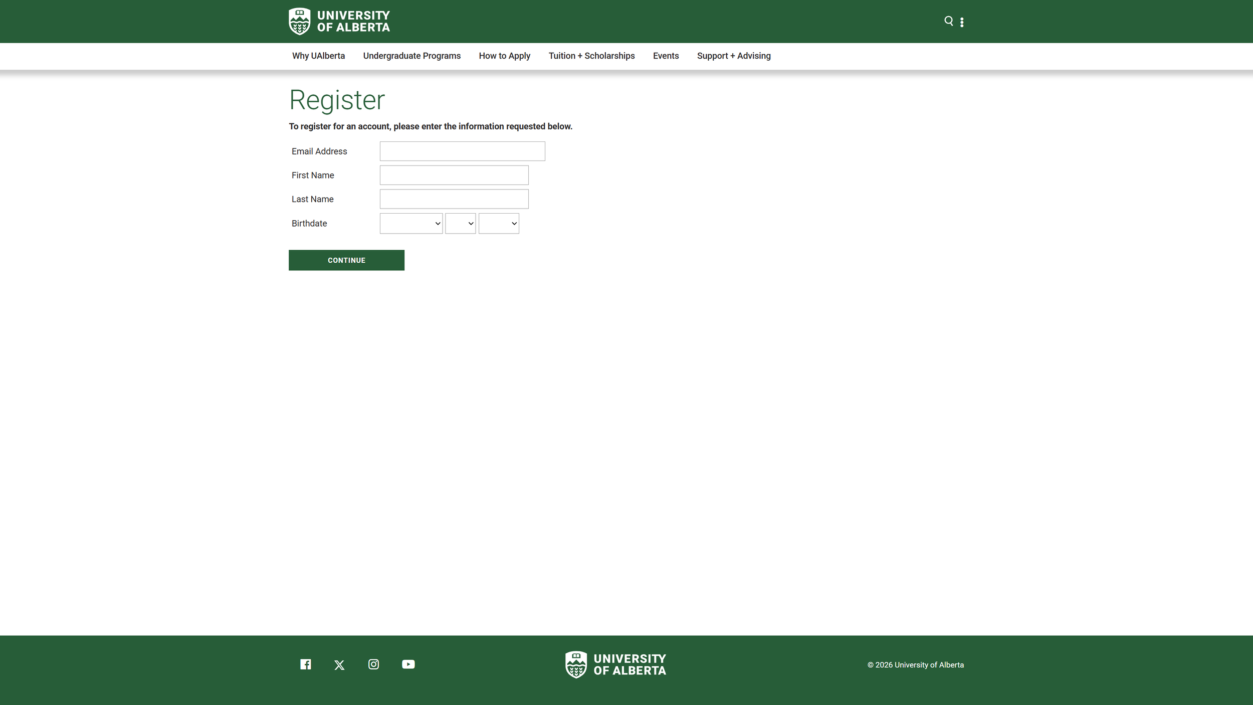
CURRENT PROCESS
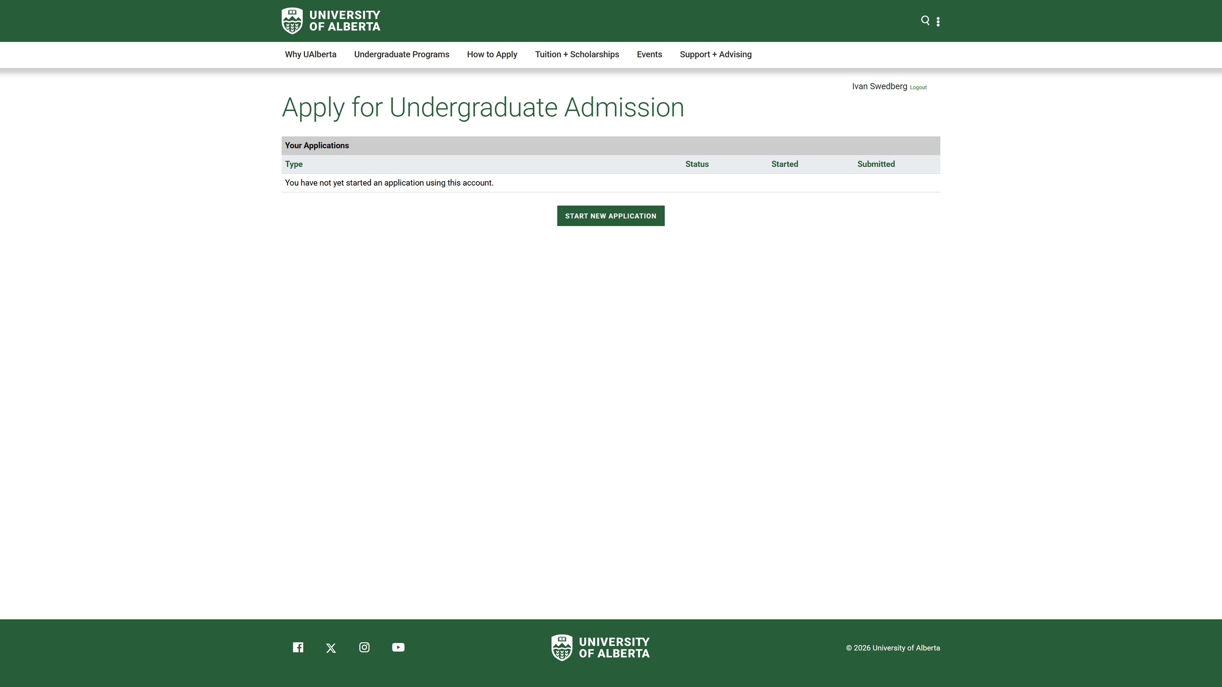
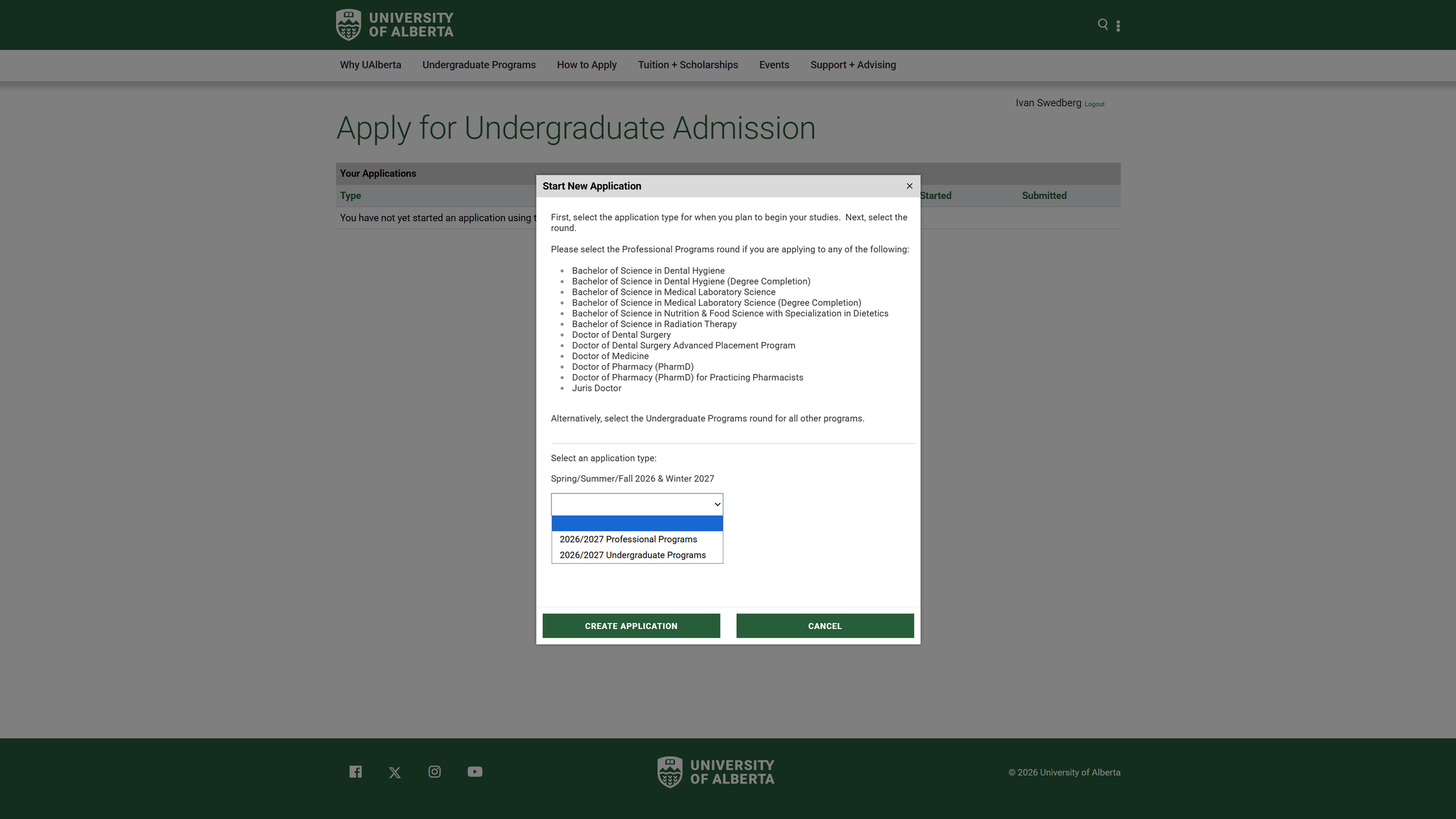
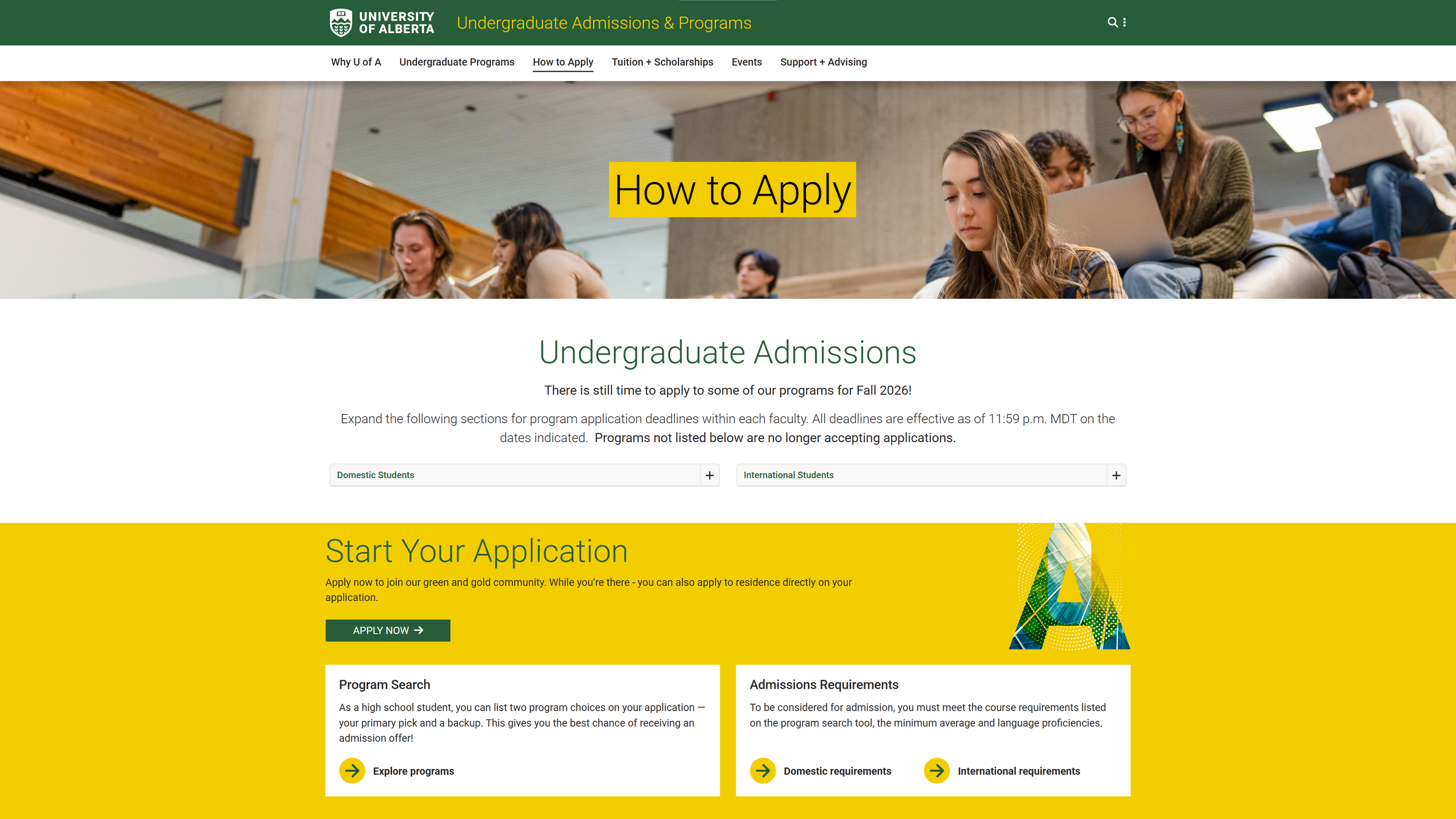
Went through the current site and completed my own application up until the payment phase (last phase before submission).
02. IDEATE
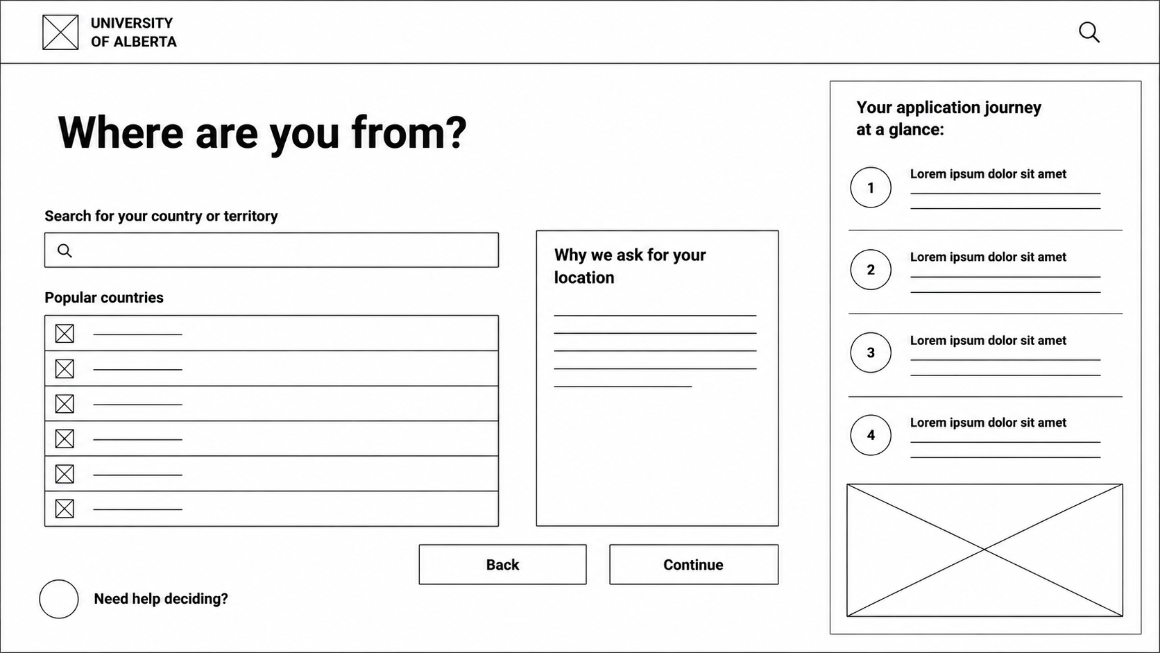
Navigation ideas
Welcome & Start

Student Type
Sketch

Country
Faculty
Program
Wireframe
Admission Criteria
Review & Submit
High Fidelity Mock-Up

03. PROTOTYPE
As this redesign was created for an established organization, the existing design system was intentionally followed. Rather than redefining the University's visual identity, the focus was on improving the application experience while maintaining consistency with its existing brand, components, and accessibility standards.
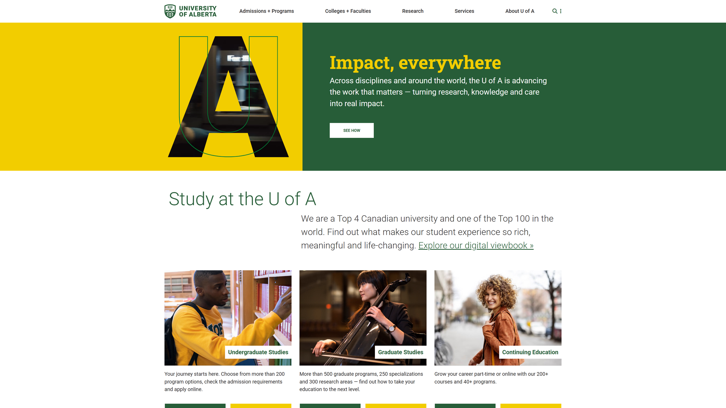
Typography: Typography follows the University's approved font system, ensuring consistency, readability, and alignment with existing digital products.
Iconography
Icons were selected from the University's existing icon library to provide familiar, accessible, and consistent visual cues across the experience.
Color Palette: The project uses the University of Alberta's established brand color palette to maintain consistency, reinforce institutional identity, and meet existing design standards.
#275D38
#F2CD00
#000000
#FFFFFF
04. TEST
Possible methods:
Heuristic evaluation
Cognitive walkthrough
Informal usability testing with peers
Self-evaluation against Nielsen heuristics
Document issues like:
People didn't notice...
People expected...
Users hesitated...
Example findings
Issue
Students expected the checklist before account creation.
Change
Moved checklist earlier.
Issue
Users weren't sure what ApplyAlberta was.
Change
Added explanation.
Issue
Too much reading.
Change
Used progressive disclosure.
Key Insights


05. IMPLEMENT
If adopted, this redesign could reduce support inquiries, improve application completion, increase student confidence, & reduce abandoned applications.
The Hand Off
MEASURING SUCCESS
If launched, success would be measured through a combination of the following:
Decrease support emails
Decrease abandoned applications
Time to locate application
Task completion rate
System Usability Scale (SUS)
Confidence rating
Number of clicks
Completion rate
NEXT STEPS
Future iterations would conduct usability testing with actual international students
Validate with Admissions
Mobile optimization
Accessibility audit
Localization features
Application status dashboard

LESSONS LEARNED
DESIGNING FOR REAL INSTITUTIONAL SYSTEMS
Working on this project reinforced that even small navigation decisions can have a significant impact on user confidence. Students weren't struggling because the information was unavailable—they were struggling because it was fragmented across multiple pages and presented out of sequence.
RESEARCH DOESN’T ALWAYS REQUIRE NEW INTERVIEWS
Having worked directly with prospective students, this project demonstrated how existing support knowledge can be translated into user-centered design decisions while still requiring validation through future usability testing.
SIMPLICITY BUILDS CONFIDENCE
Rather than adding new functionality, the redesign focused on reducing uncertainty through clearer navigation, progressive disclosure, and better organization. Helping users feel confident at every step proved just as valuable as helping them complete tasks efficiently.